Dashboards & Widgets Overview
Build charts, KPIs, and richly formatted tables from your synced bank data on an always-editable canvas, then publish or embed them.
7 min read
On this page
Dashboards turn the financial data you already sync with BankSync into charts, big-number KPIs, and richly formatted tables. You build a dashboard by dropping widgets onto a grid, pointing each widget at your data, and choosing how to chart it. When a dashboard loads, widgets can reuse cached results according to their source's freshness policy.
The Dashboards tab is also your workspace landing page. One ordinary, workspace-shared dashboard has the Home role and opens whenever a member enters Dashboards. The starter Home dashboard is locked initially, and both the dashboard explorer and widget library stay closed so the dashboard has the full canvas. You can open either from the toolbar or with its keyboard shortcut. Editors can unlock the starter or choose a different Home dashboard from the explorer or Settings; changing Home never renames or automatically locks either dashboard.
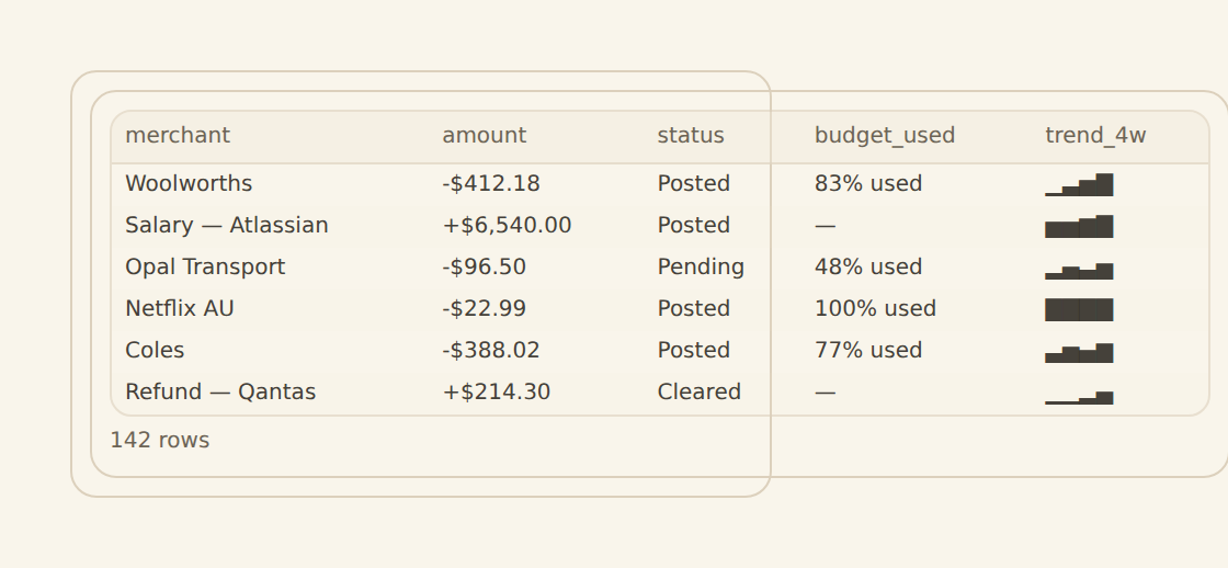
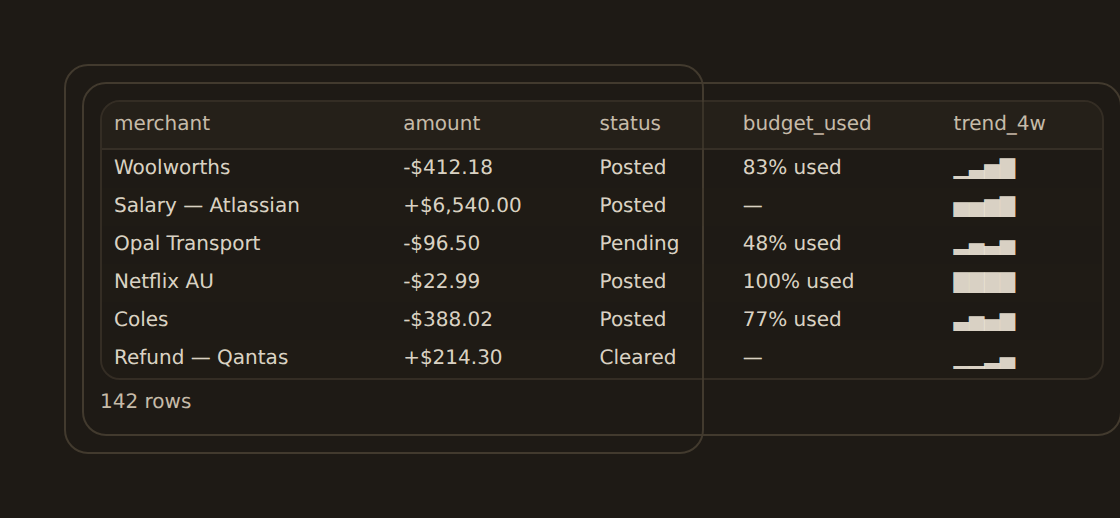
Widgets can read from a synced feed, a connected bank or provider, or a BankSync table. BankSync checks the source's real field catalog before it creates a runnable widget. Feeds are a common starting point, but they are not required.
Feed data vs. live bank data
You can design before connecting data
You can create a dashboard and place widgets with no bank, feed, or table connected. A widget placed this way is a real widget from the moment it lands — move it, rename it, duplicate it, or delete it like any other. Its cell reads No data source connected yet and offers Choose data, which opens the widget's Data tab. Connect a source whenever you are ready; if your workspace has none yet, the cell offers Connect bank, Create table, and Create feed instead.
Availability
A Partial badge means that some source or result rows were omitted. Sorting and totals reflect only the available subset. This can also affect a big-number KPI: a single total does not mean all source rows were included. Aggregating the same subset does not recover missing rows.
Changes to read limits or completeness handling must refresh affected cached results. When a refreshed result changes its values, columns, partial-data notice, or error guidance, the dashboard must receive that correction even if the source's sync version has not changed.
Query sums, averages and other numeric aggregates skip missing or nonnumeric values. An average divides by the number of numeric observations, and a result with no numeric observations is blank rather than zero. Genuine numeric zero still contributes. Count measures selected rows. Each metric's filter applies before its calculation; changing execution strategy must preserve those results. Missing required financial fields still need a source-quality assessment: a subtotal of available amounts does not establish that every amount was present.
What a dashboard is made of#
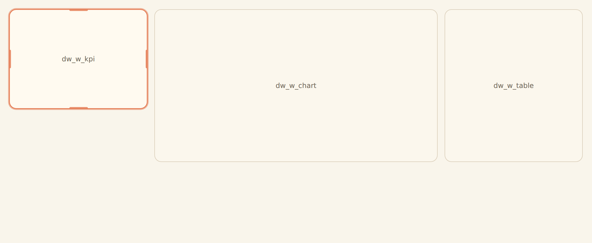
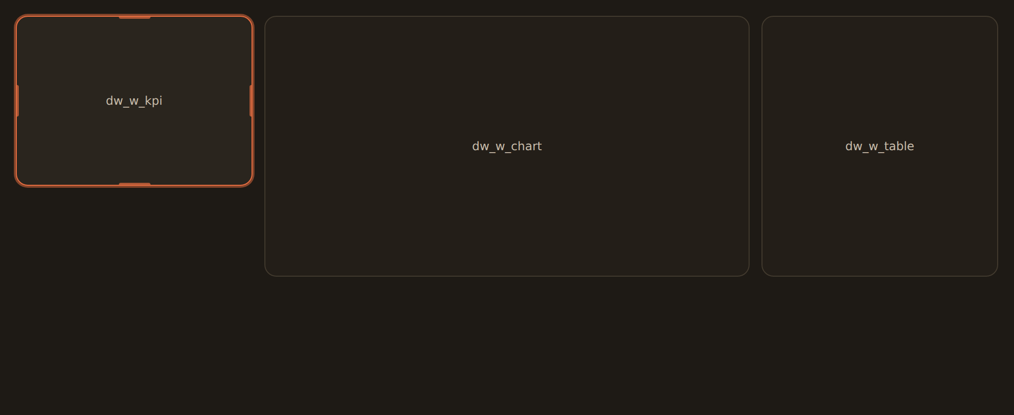
A dashboard has four moving parts. You will spend most of your time in the canvas (where widgets sit) and the inspector (the panel that configures whichever widget you have selected).
Canvas
A resizable grid where each widget lives. Drag to move, drag an edge to resize. Your layout saves automatically.
Widget library
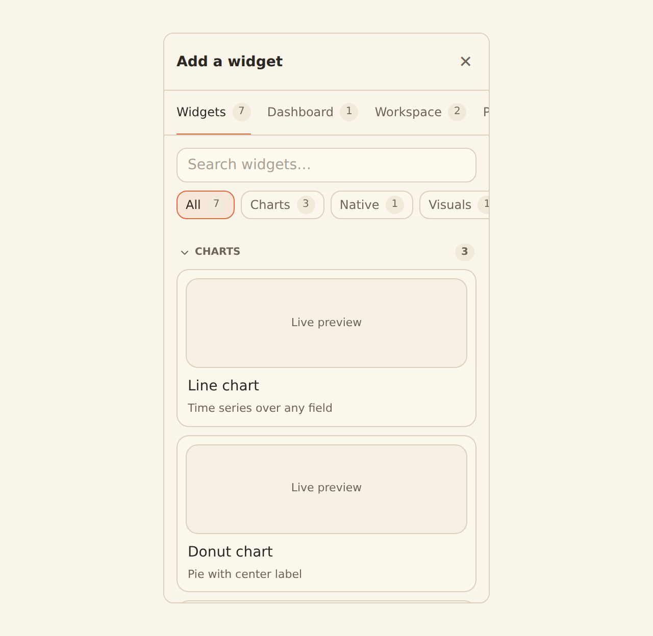
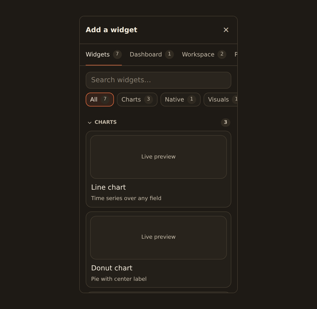
The panel you add widgets from. Describe a chart in plain language, pick from suggestions, browse chart kinds, or reuse a widget you already built.
Inspector
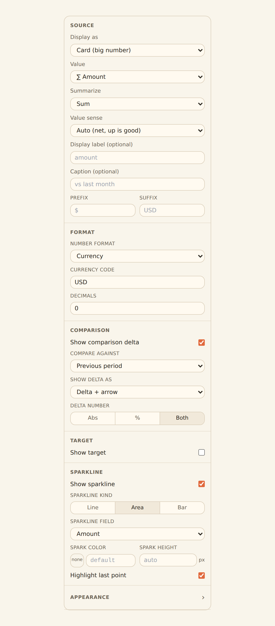
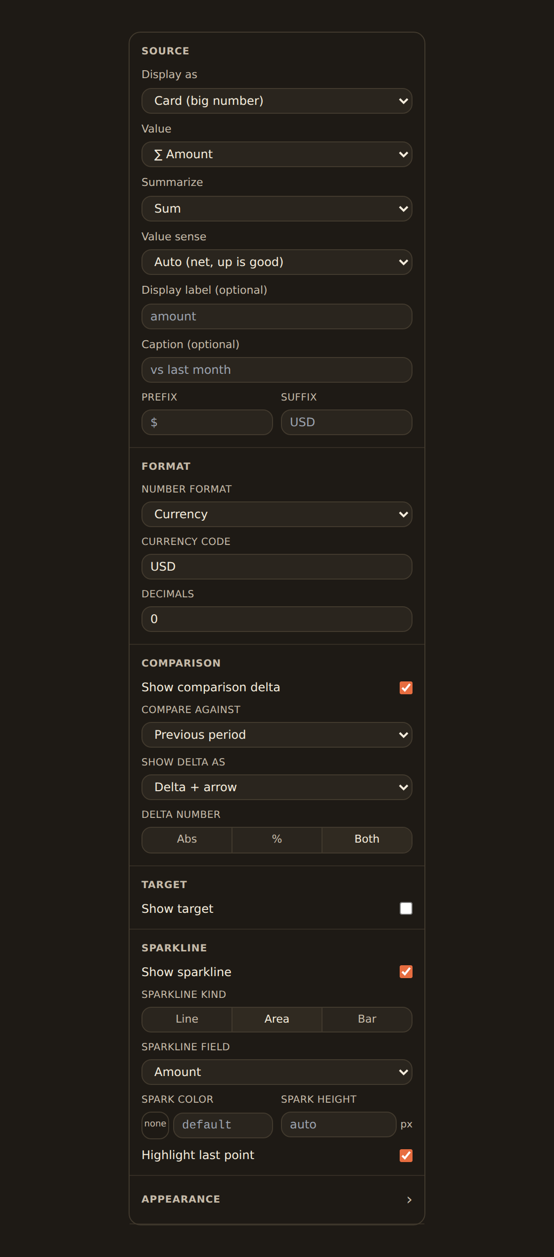
The right-hand panel that configures the selected widget: its data, its chart kind, and its styling. (Select a widget to open it.)
Filters
Dashboard-wide controls (like a date range) that every widget responds to at once.
What a widget can be#
Widgets are saved workspace resources, not disposable dashboard cells. The same widget can be placed on several dashboards—or more than once on one dashboard—and canonical Data, Style, and Share changes follow every placement. Open Widgets beside Dashboards to manage, order, preview, and trace those reusable resources. See Managing widgets for the complete workflow.
A widget is not only a line chart. When you add one you choose a kind, and the catalog is broad:
- Charts: lines, areas, bars and columns, pies and donuts, plus many more specialized kinds (treemaps, heatmaps, box plots, and so on) for when you need them.
- Big-number KPIs: a single headline figure (like total spend this month), optionally with a comparison arrow against the previous period and a small trend sparkline.
- Gauges: a dial that shows progress toward a goal with green / amber / red bands, good for things like a savings-rate target.
- Tables: rows of data with rich, per-column formatting. Columns are not just plain text: they can render as currency, status pills, progress bars, mini sparklines, ratings, links, and more, so a table can be as readable as a chart.
You are never locked into your first choice. Switch a widget's kind in the inspector at any time, and BankSync carries over the fields you have already bound.


Let an agent build it
You do not have to place every widget by hand. If you drive BankSync through an AI agent, you can ask the agent to create whole dashboards and widgets for you (this is available in beta, alongside the in-app Dashboards feature).
Two ways to start#
A blank dashboard
Start from an empty canvas and add widgets one at a time. Good when you know what you want to see.
A template
Start from a prebuilt dashboard, point it at your feeds, and tweak from there. Good for a fast, polished start.
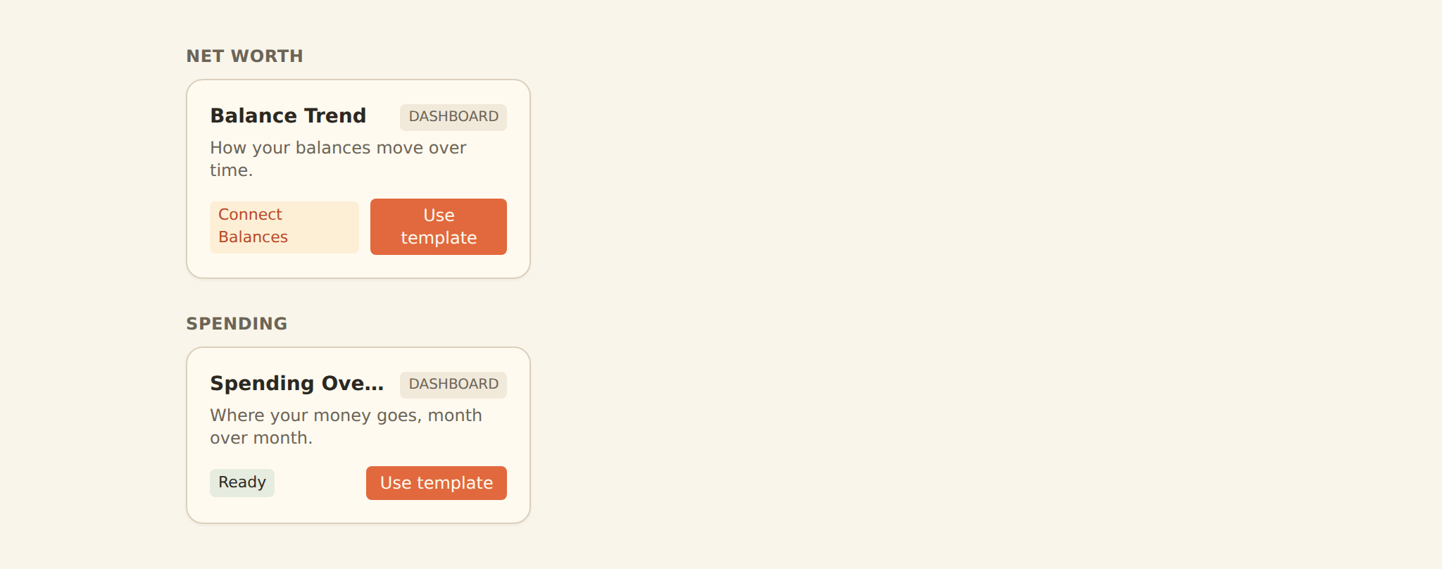
A brand-new dashboard opens its widget library to help you start, and remains a draft until you give it a name, add a widget, or add a filter. Once you do, BankSync saves it for real and it appears in your dashboards list. Until then it stays an unsaved scratch space, so you can experiment without cluttering your workspace.
A worked example#
The fastest way to understand all of this is to build one widget end to end. Say you want to see what you spent each month, broken down by category:
- Open a blank dashboard and click Add a widget.
- In the Ask tab, type
spending by month by category, or pick a Bar chart from the chart kinds. - If BankSync finds one compatible source, review the Using … confirmation. If it finds several, the widget lands unconnected and its Data tab suggests the closest matches and lets you pick any bank, feed, or table in your workspace. You can leave it unconnected and come back.
- Group by Category, and set the value to Sum of Amount.
That is it. The widget renders, and your spend-by-category chart updates every time the dashboard loads. From here you can switch it to a different chart kind, add a date-range filter, or drop in a KPI for total spend.
Autosave, permissions, and locked dashboards#
There is no Save button. When you have editor access and the dashboard is unlocked, every change you make is saved automatically. The toolbar shows Saving, Saved, or a retry action when persistence fails. Viewers get a read-only dashboard, and a locked dashboard asks an editor to unlock it before changing content. On a phone the layout remains safe to scroll; editors can still connect a widget's data without turning the canvas into a touch-drag surface.


What people you share with see
"No view mode" applies to you, the author. When you publish a dashboard, the people you share it with see a separate, read-only view: they can read and filter it, but they cannot edit your widgets or layout. See Publishing and sharing for how that works.
Where to go next#
Recommended path
Create your first dashboard
Open a blank canvas and learn the editor layout and keyboard shortcuts.
Add a widget
Use the library to add your first chart, KPI, or table.Connect it to your data
Point the widget at a feed (or a live bank source), then pick what to group by and measure. This is what "binding data" means: telling the widget which numbers to show.
Pick a chart kind
Browse the chart catalog and choose how to draw it. You can switch kinds at any time.
Try KPIs, tables, and gauges
Not everything is a chart. Add a headline number, a formatted table, or a goal gauge.
Publish or embed
Share a read-only link or embed a widget in your own site.
Related guides#
- Creating your first dashboard: the editor, shortcuts, and autosave.
- Adding widgets: the library and the four ways to add a widget.
- Managing widgets: reusable widgets, previews, dependencies, and safe deletion.
- Binding data: group by, value, aggregation, and bucketing.
- Chart kinds: the full catalog and which one to reach for.
- KPI, table & gauge widgets: the non-chart widget kinds and their formatting.
- Templates: start from a prebuilt dashboard.
- Organizing dashboards: folders, renaming, and keeping a tidy list.
- Publishing and sharing: read-only links and embeds.
- Custom-widget data and permissions: bind package inputs, review access, and configure generated settings.
- Create your first feed: get data flowing before you chart it.
Create your first dashboard
Use this page with your AI assistant
Every BankSync doc is available as plain Markdown for agents and LLMs.