Layout & Composition Widgets
Use combo charts, stat grids, dividers, and tabs to overlay measures, group KPIs, add section structure, and fit more onto one dashboard.
8 min read
On this page
- Combo chart: overlay measures on one chart
- How layers work
- Two y scales: shared or independent
- Worked example: revenue bars and a margin-percent line
- Stat grid: several KPIs in one block
- Divider: line, space, or section header
- Tabs: more than one view in one area
- Building a tabs widget
- Putting widgets into a tab
- Which one do I reach for?
- Related guides
Most widgets show one thing: one chart, one number, one table. The widgets on this page do something different. They compose: a combo chart overlays several measures on one set of axes, a stat grid packs several KPIs into one block, a divider adds visual structure, and tabs group widgets so a single area can hold more than one view. Use them when a plain chart or KPI is not enough to tell the story.
These are advanced building blocks
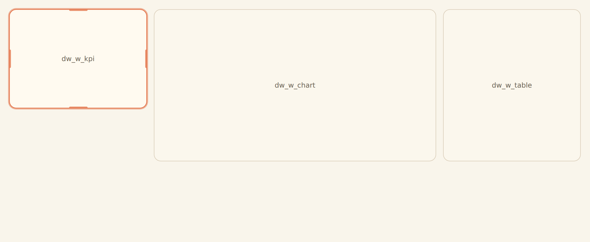
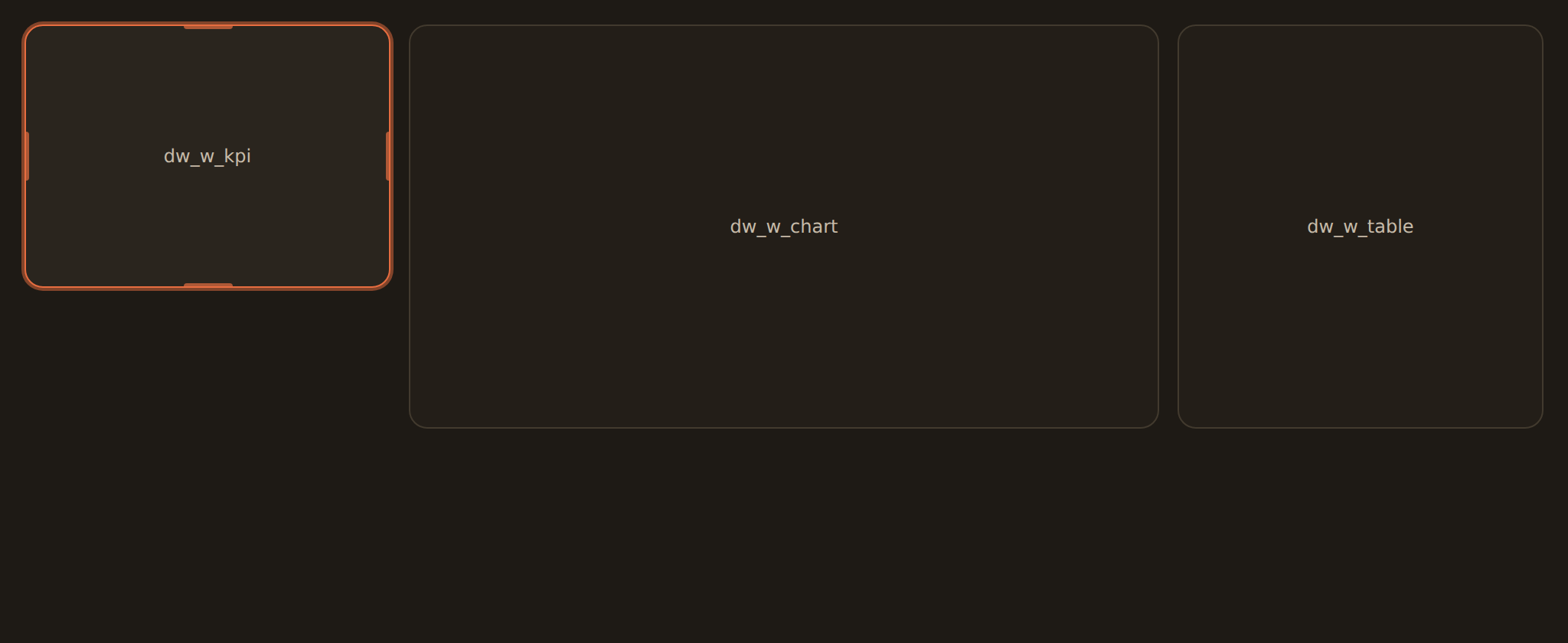
A combo chart, a stat grid, a section divider, and a tabs container all sit on this same 12-column grid alongside ordinary charts and KPIs, so you place, resize, and arrange them exactly like any other cell.
Combo chart: overlay measures on one chart#
A combo chart (called a layer internally) draws more than one kind of mark on the same horizontal axis. The classic example is revenue bars with a margin-percent trend line on top, where the two series use different scales. Instead of inventing a separate "bar-plus-line" chart kind, BankSync layers the marks: each layer is one mark (a line, bar, area, or scatter) plotted against a shared x axis.
How layers work#
- One shared x axis. Every layer is drawn against the same x field (for example, Month). You pick the x field once.
- Each layer plots its own measures. A layer carries one or more Y measures, and can have its own grouping (split into series) and color.
- Marks can mix. A bar layer and a line layer can sit on the same chart, so you get columns plus a trend line in one view.
Two y scales: shared or independent#
The most useful combo trick is putting two measures that live on different scales onto one chart, like dollars and percentages. That is controlled by the y-scale setting:
| Setting | What it does | When to use it |
|---|---|---|
| Shared | Every layer is measured against one common y axis | Both measures are in the same units (for example, two dollar amounts) |
| Independent | Each layer reads the y axis its measure is assigned to: a primary (left) or secondary (right) axis | The classic dual axis: revenue dollars on the left, margin percent on the right |
Each Y measure is tagged as primary or secondary. With the independent setting, primary measures share the left axis and secondary measures share the right axis, so a small percentage and a large dollar figure each get a readable scale.
Worked example: revenue bars and a margin-percent line#
This is the canonical combo. With your data grouped by month:
- Set the shared x axis to Month.
- Add a bar layer plotting Revenue, assigned to the primary axis.
- Add a line layer plotting Margin %, assigned to the secondary axis, with smoothing on.
- Set the y scale to Independent.
You now read revenue as columns against the left axis and the margin trend as a smooth line against the right axis, in one chart.
Overlay a second source, like actual vs budget
The finished chart reads as revenue columns against the left axis with a smoothed margin-percent line tracking against the right axis, both in a single view.
Stat grid: several KPIs in one block#
A stat grid is a tidy row or grid of KPI cards built from one query result. Where a single KPI shows one headline number, a stat grid shows several side by side: think "this month's income, expenses, net, and savings rate" as four cards in one widget rather than four separate widgets you have to line up by hand.
- Each cell is a KPI. Every metric in the grid carries the same controls a standalone KPI has: a value, a summary, a comparison delta, a sparkline, formatting, and so on. (See KPI, table & gauge widgets for those controls.)
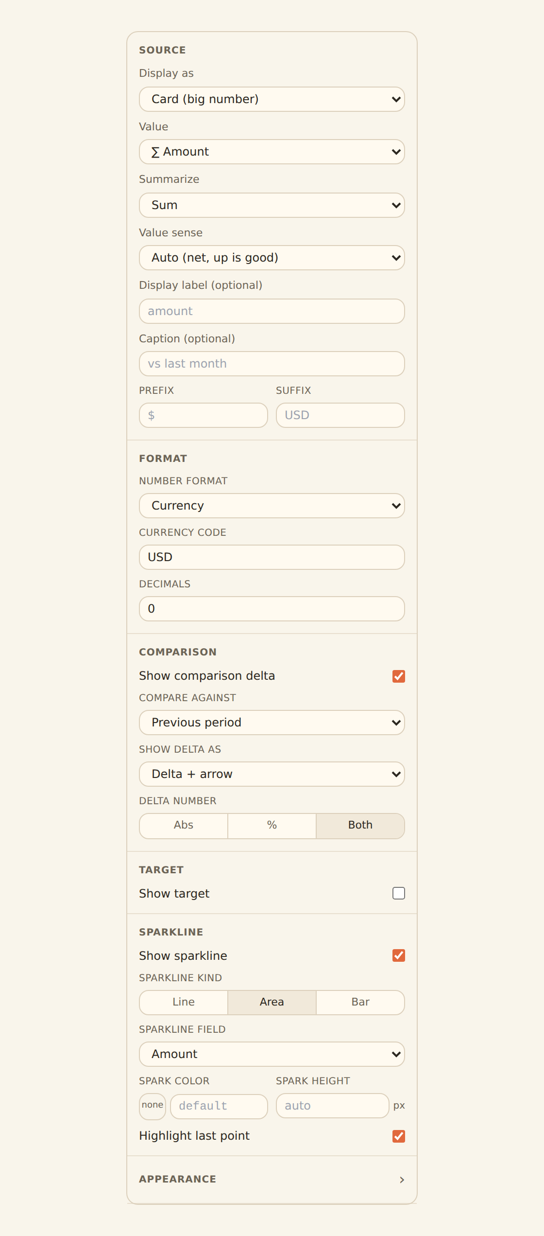
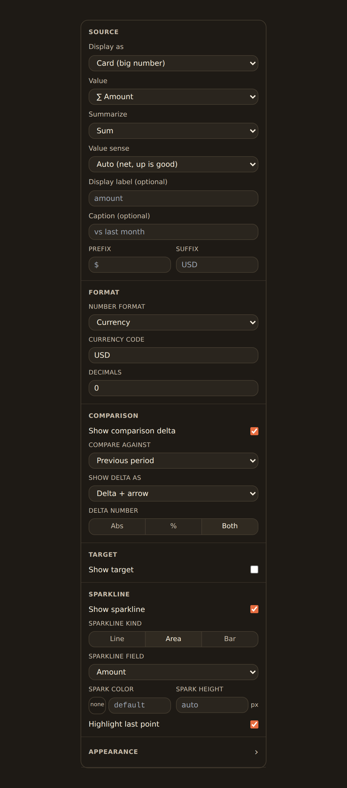
- The grid handles the layout. Set the number of columns (or let it flow automatically), the gap between cells, and whether to draw dividers between cells. A shared variant (card, plain, outlined) and density apply to every cell unless a cell overrides it, and you can add a title above the whole grid.
Stat grid is still being rolled out
Once rendering ships, a stat grid reads as a single block of evenly spaced KPI cards, for example a four-up row showing income, expenses, net, and savings rate together.
Divider: line, space, or section header#
A divider adds visual structure to a dashboard without showing any data. It is the simplest composition widget and renders immediately. It has three sub-kinds you switch between in its inspector:
| Sub-kind | What it draws | Controls |
|---|---|---|
| Line | A horizontal rule across the cell | Color, thickness, and style (solid, dashed, dotted) |
| Header | A section title (for example "Cashflow") | Text, alignment (left/center/right), font size, weight, and color |
| Space | Blank breathing room | Height in pixels |
Switching the sub-kind only shows the controls that apply to it, so the Header controls appear only when the sub-kind is Header, and so on. A divider spans the full width of the dashboard, which makes it ideal for breaking a long dashboard into labelled sections.
Group a long dashboard into sections
In the divider inspector you pick the sub-kind first, and the panel then shows only that sub-kind's controls: choosing Header, for example, reveals the text, alignment, font-size, weight, and color fields.
Tabs: more than one view in one area#
A tabs widget is a container that groups other widgets behind a tab strip, so one area of the dashboard can hold several views the reader switches between. Use it when you have, say, a "By month" chart and a "By category" chart that answer related questions but you do not want both on screen at once.
Building a tabs widget#
You configure the tabs themselves in the tabs inspector:
Set up tabs
Add and name tabs
Add a tab, give it a clear label, and optionally an icon. Reorder or remove tabs from the same panel.
Pick the default tab
Choose which tab is active when the dashboard first loads. If you do not, the first tab wins.
Style the strip
In Appearance, set the strip's position (top, bottom, left, right), its style (underline, pills, segments, enclosed), alignment, colors, and whether switching tabs animates.
Add a badge (optional)
A tab can show a small badge value next to its label, such as a count.
Putting widgets into a tab#
The tab inspector sets up the tabs; which widgets live in each tab is decided on the canvas, by dragging widgets into the active tab rather than in the inspector. A tab simply references the widgets assigned to it, so the same widget is never duplicated.
Tab content placement is still landing
On the canvas a configured tabs widget shows its interactive strip (for example three pill-style tabs, one carrying a count badge) above a content area that, for now, displays the "Drop widgets into this tab from the canvas" prompt.
Which one do I reach for?#
| Goal | Use |
|---|---|
| Two measures, one on each scale (dollars and a percent) on one chart | Combo chart with the independent y scale |
| Several headline numbers grouped together | Stat grid (or, today, KPIs side by side) |
| A section title or visual break in a long dashboard | Divider (header / line / space) |
| Two related views in one area, switched by the reader | Tabs |
Related guides#
- Dashboards & widgets overview: how the canvas, library, inspector, and filters fit together.
- Adding widgets: the everyday ways to put a widget on the canvas.
- Binding data: the Group by, Value, and series controls a combo chart's layers share with every chart.
- The chart kind catalog: the single-mark chart kinds a combo overlays.
- KPI, table & gauge widgets: the KPI controls each stat-grid cell reuses.
- Dashboard templates: templates are the easiest way to get a combo, stat grid, or tabs onto a dashboard today.
Publish and share your dashboard
Use this page with your AI assistant
Every BankSync doc is available as plain Markdown for agents and LLMs.