KPI, Table & Gauge Widgets
Configure the three non-chart widget types: a KPI big-number with comparison, target and sparkline, a richly-formatted table with per-column control, and a gauge with a needle and color bands.
5 min read
On this page
Not every widget is a chart. Three widget types show numbers without an x/y plot: the KPI for a single headline figure, the Table for rows of detail, and the Gauge for a value against a scale. Each has its own set of controls.
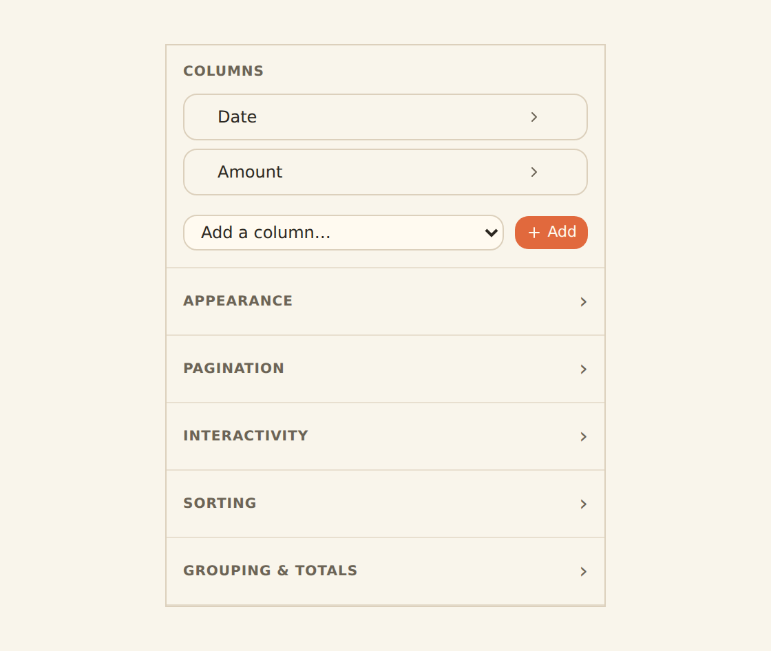
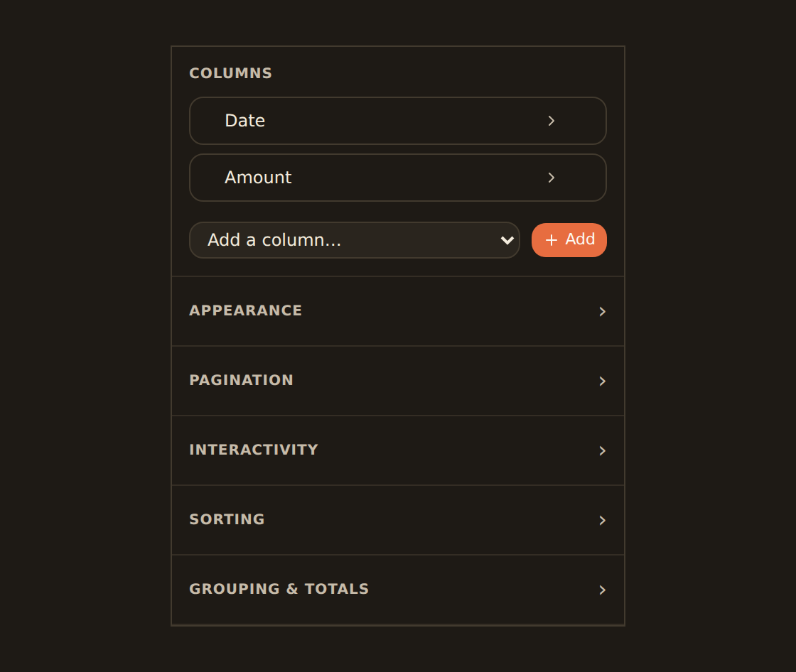
Where these controls live
KPI: one number that matters#
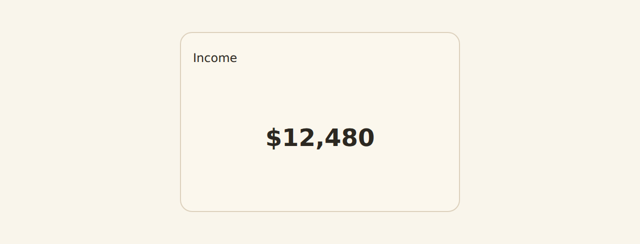
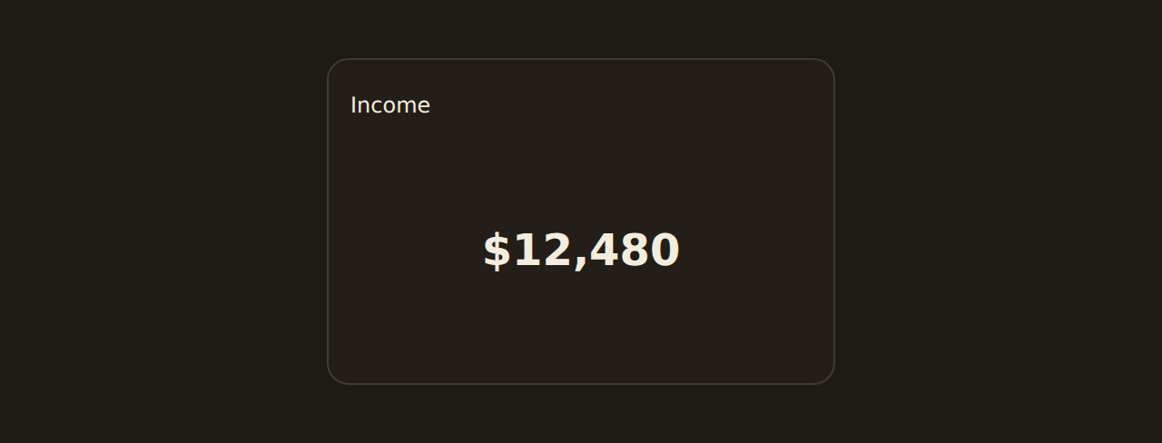
A KPI shows a single big number (this month's spend, total balance, transaction count) with optional context around it.
Value and summary
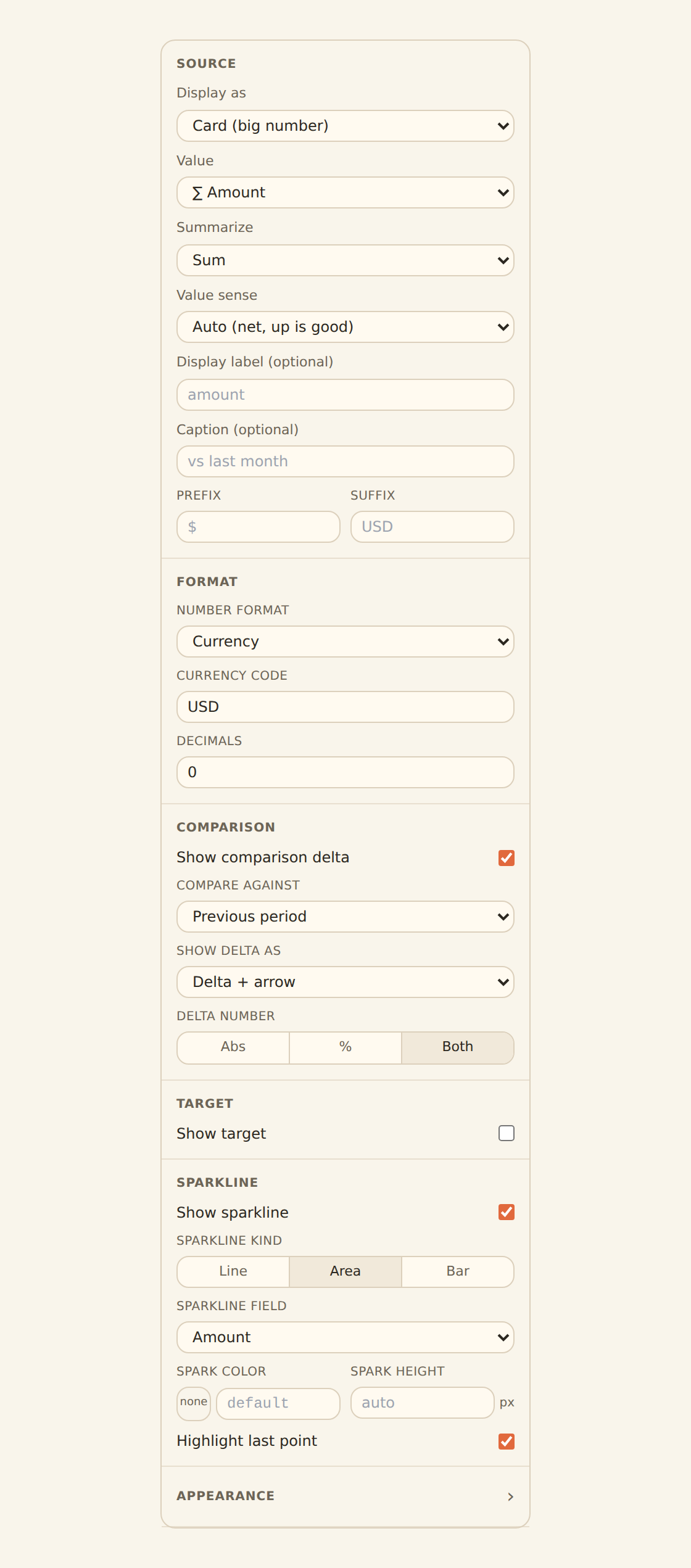
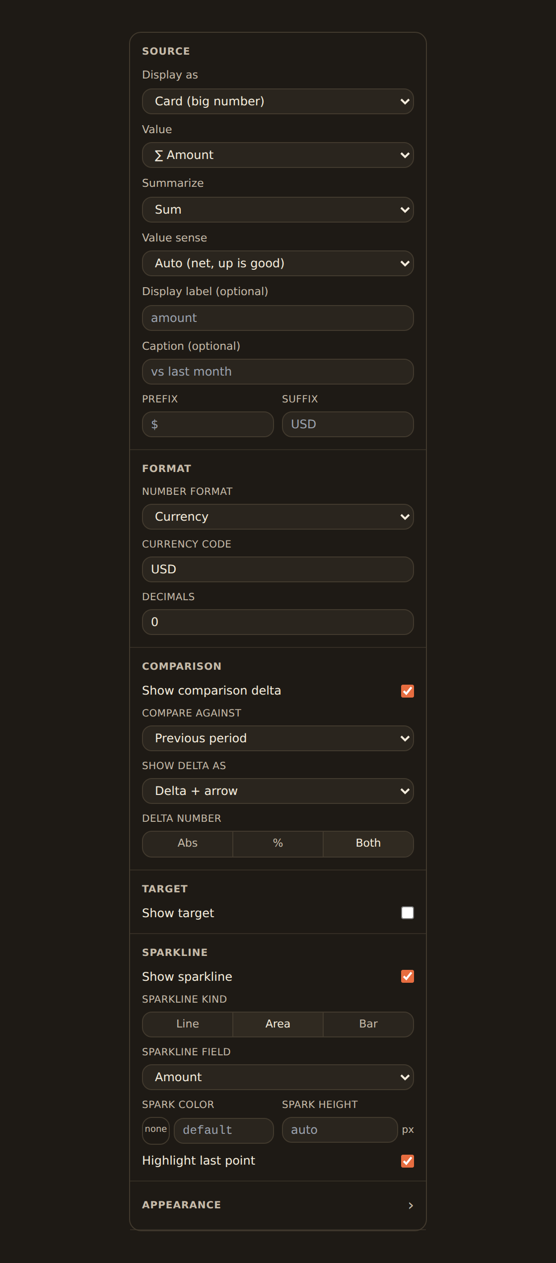
Pick the field (BankSync limits the picker to measures, the numeric fields it can total), then choose how to summarize the result: Sum, Average, Median, Min, Max, Count of rows, or the latest/earliest row.
Comparison
Show the change against a prior period as an up/down delta, so the number has direction. Compare against the previous period, the previous year, a fixed baseline, or a rolling window.
Sparkline
Add a tiny inline trend line beneath the number for at-a-glance history.
The KPI inspector also lets you choose a Display as style so the same number can read as a plain card, a change-focused delta, a progress bar toward a target, a bullet (target plus bands), or a gauge. Add a prefix/suffix (for example a $ or %), a label and a caption (such as "vs last month"), and pick whether the number formats as a plain number, currency, percent, or a compact value with set decimals.
Set a target for budget-vs-actual
Worked example: spend this month, vs last month#
- Add a KPI widget and select it to open the inspector.
- Under Value, pick your amount field and set Summarize to Sum.
- Turn on Comparison and set Compare against to Previous period, so the delta reads "vs last month".
- Optionally turn on Sparkline for a small trend line, and add the caption "vs last month".
You now have a single headline number with direction, no chart required.
Table: rows with per-column control#
A Table widget lists rows from your data with control over each column.
Shape a table
Choose and order columns
Show the fields you want and drag to reorder them; remove the ones you do not need.
Set how each column reads
Open a column and pick its Format. The choices are Text, Number, Currency (with a currency picker), Percent, Date, Relative date, Yes/No, Duration, and JSON. BankSync picks a sensible default from the data, and you can override it per column.
Align, pin and size
Per column you can set the alignment (left/right/center), pin it to the left or right edge so it stays in view as you scroll sideways, set a fixed width, and toggle whether the column is sortable.
Rename and pick an icon
Give the widget a clear title and icon so it is easy to find.
Beyond the per-column format, the Appearance section sets the look of the whole table: row density (comfortable/compact/tight), borders, zebra stripes, row numbers, a sticky header, a sticky first column, and whether long text wraps.
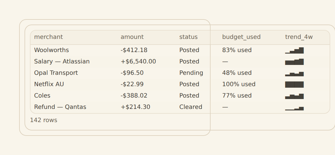
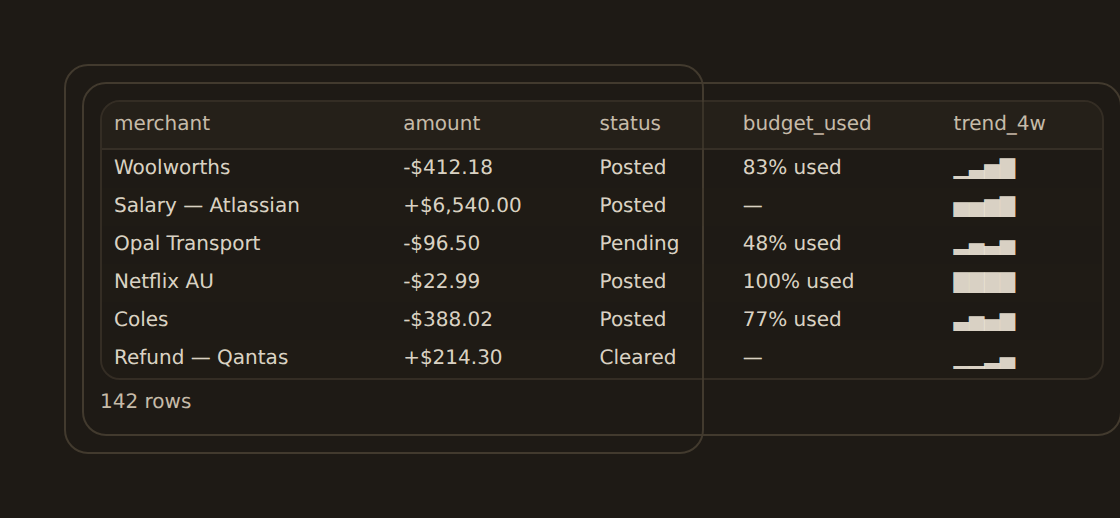
Rich cell formats render automatically
How coloring works
Pagination#
Long results stay readable because the table paginates. The Pagination section lets you choose the mode: Paged (the usual default, with page controls), Virtual (smooth scroll through a long list), or None. When pagination is on, set the rows per page (default 25). Pagination is a setting you can change, not something fixed.
Gauge: a value on a scale#
A Gauge draws a needle on a banded arc, good for a value measured against a target or a healthy range.
Value
Type or pick the result value the needle points to. This is a free-text box with suggestions, not a field dropdown, and the gauge sums the rows for you (there is no separate aggregate choice).
Scale
Set the min and max, the arc shape (half, three-quarter, full), and thickness.
Bands
Add colored bands (for example green, amber, red) so the reading has meaning at a glance.
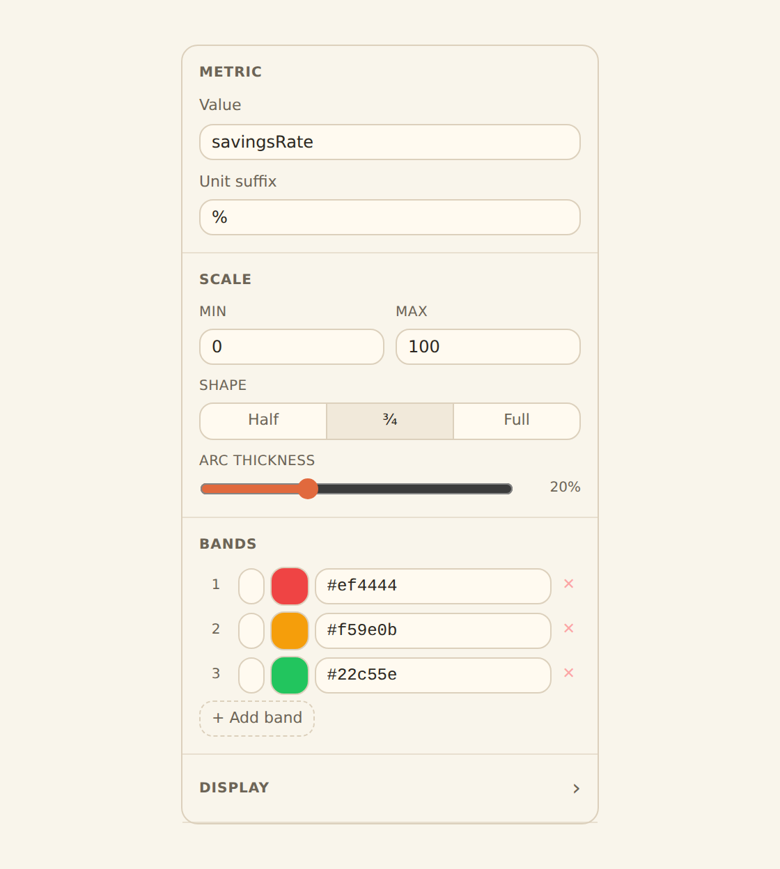
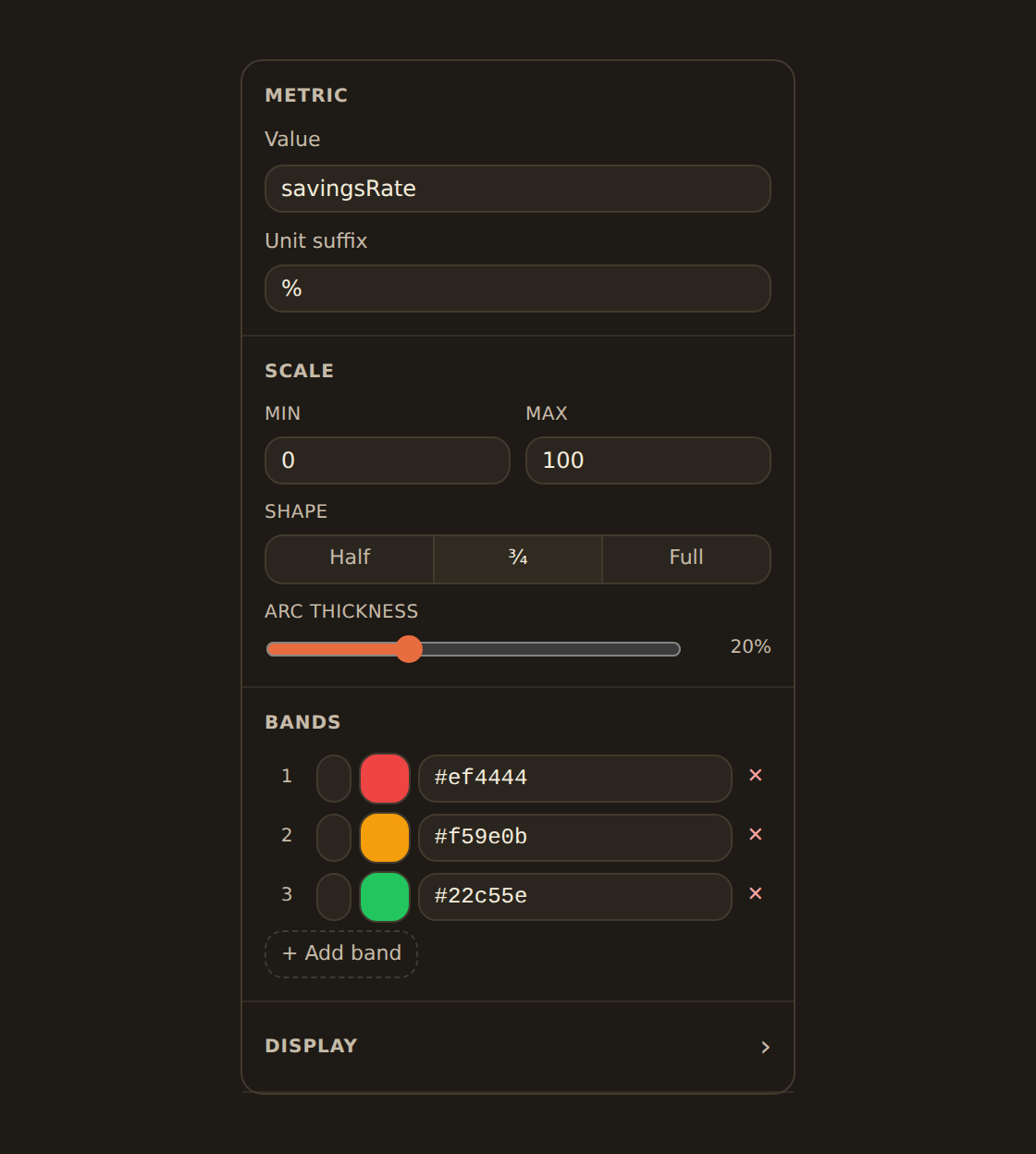
Gauge bands
Worked example: savings rate against a 70% target#
- Add a Gauge widget and select it to open the inspector.
- Under Value, type the alias of your savings-rate result (the suggestions list helps); the gauge sums the rows to a single figure.
- Set the Scale min to 0 and max to 100, with a percent unit.
- Add three Bands: red up to 50, amber up to 70, green beyond 70.
The needle now lands in the band that matches your savings rate, so the reading is a status, not just a number.
Related guides#
- Binding data: the Value and summarize controls these widgets share with charts.
- The chart kind catalog: the plotted chart kinds.
- Adding widgets: add a KPI, table, or gauge from the library.
Add dashboard filters
Use this page with your AI assistant
Every BankSync doc is available as plain Markdown for agents and LLMs.