Binding Data: Group By, Value, Aggregation & Bucketing
Connect a widget to a compatible bank, feed, or table and shape it with semantic field roles, aggregation, and time bucketing.
9 min read
On this page
Binding is how you tell a widget what to show: which bank, feed, or table to read, what to put on each axis, and how to summarize the numbers. BankSync validates the source and its authoritative fields together before the widget becomes runnable. You do it in the inspector's Data tab with plain controls, and the chart updates as you go.
The rich controls on this page (date bucketing, aggregate, Keep top N, Spending/Income/Net) appear for the common chart kinds that show their fields as labeled chips: line, area, bar, column, scatter, pie, donut, and the like, plus the KPI, table, and gauge widgets. A handful of less common kinds (radar, treemap, box plot, heatmap matrix, and a few others) show a simpler Data tab: one plain field picker per role (Category, Value, and so on), with no bucket or aggregate dials. If your widget shows simple field pickers instead of chips, that is expected for those kinds.
Want to follow along? Build monthly spending
Choose a data source#
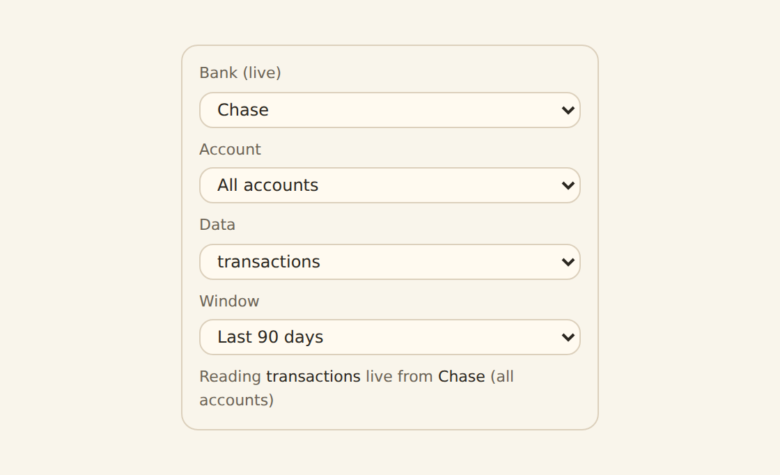
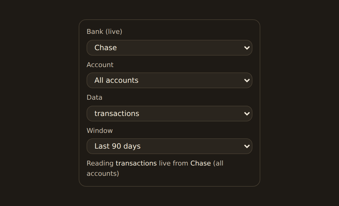
Each ordinary widget reads from one source. BankSync considers every accessible bank account scope, synced feed, and table whose field semantics fit the widget. One unambiguous candidate may be selected automatically and is always shown as Using the source name · Change. Several viable candidates always produce a choice.
Changing a source is validated before it is saved. Compatible bindings carry over; incompatible fields are listed with valid replacements. A breaking change is refused until you choose the corrected fields, so another dashboard using a shared query is never silently broken. This dashboard is the default edit scope; Everywhere is explicit and validates every dependant.
Tables use their current field catalog and resource type. Renaming a display label does not invent a new key, and a numeric field is not accepted merely because a widget needs “some number”: currency, additivity, grain, and time meaning are considered too.
With no compatible source, the widget stays unconnected rather than producing a render error. Connect a bank, create or import a table, or set up a feed, and BankSync reopens the same widget when you return.
Package-based custom widgets can declare several logical inputs instead of one primary source. Their Data tab shows one card per input. Choose a compatible bank or feed for each; BankSync maps canonical fields and sends only the projected columns to the sandbox. See Custom-widget data and permissions for consent and repair states.
The channels#
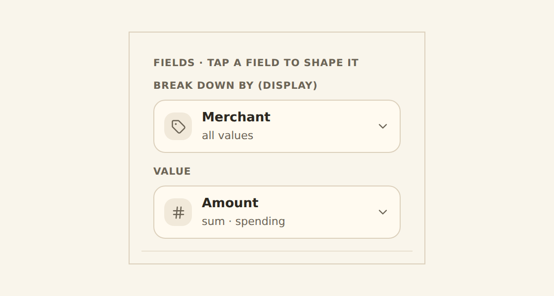
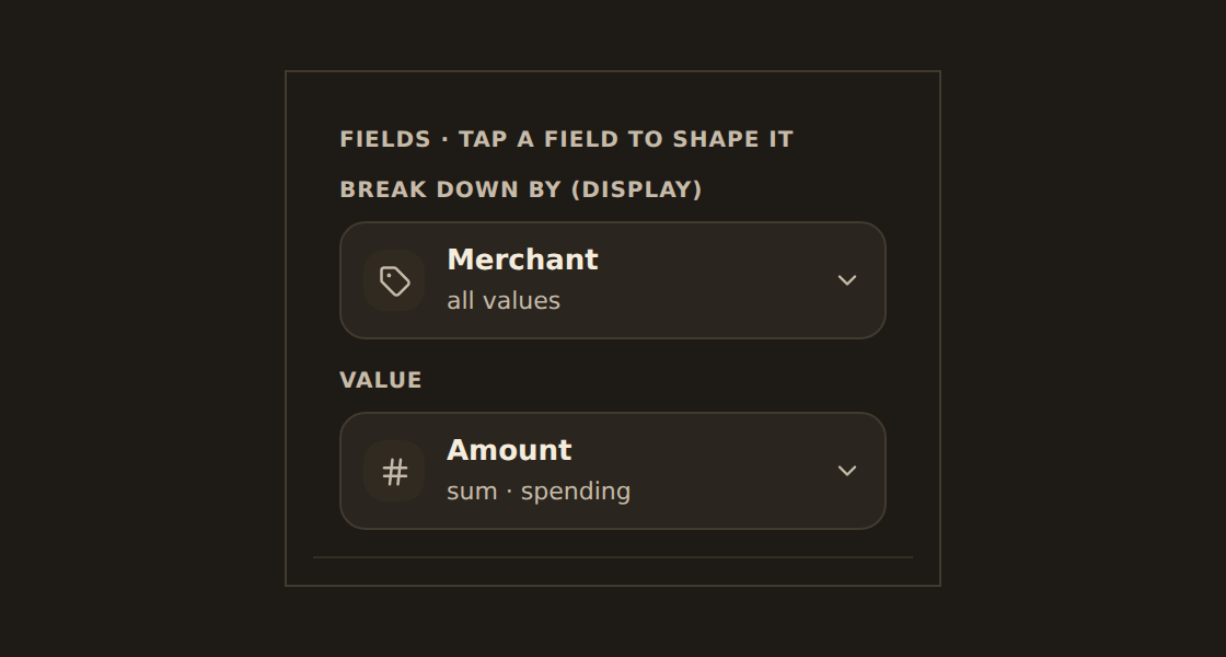
A chart maps fields from your data onto visual roles. Each role is a labeled chip in the Data tab; tap a chip to pick its field and adjust how it behaves. Read each chip as the plain question it answers:
Group by
"What goes along the bottom?" The category or time field on the x-axis: merchant, category, or date.
Value
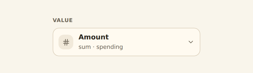
"What number am I measuring up the side?" The measure on the y-axis: amount, count, or balance.
Split into series
"Do I want one line per group?" An optional second category that splits one line or bar into several, one per value.
Those are the three roles you will reach for on almost every chart. (Some kinds expose a Color chip too, which works like a second Group by.)
Charting two numbers at once (combo charts)
Bucketing dates#
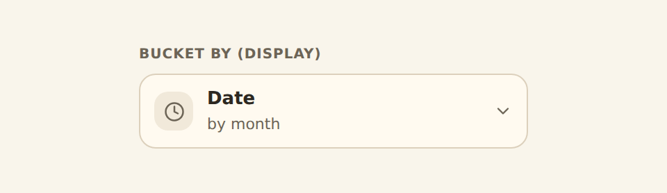
When you Group by a date, you rarely want one point per day forever. Tap the date chip to open its Bucket by control and group dates into readable periods:
| Bucket | Shows |
|---|---|
| Day / Week / Month / Quarter / Year | One point per calendar period. |
| Exact | Every individual timestamp, no bucketing. |
Pick the period that tells the story (monthly for a yearly trend, daily for a single month). You never write a date formula; the chart re-buckets instantly.
Cyclical buckets#
Below the calendar periods, a Cyclical section folds every date into a repeating cycle, which is exactly what you want for "when do I spend?" questions rather than "how much over time?":
| Cyclical bucket | Answers |
|---|---|
| Hour of day | Which hours see the most activity (0 to 23). |
| Day of week | Which weekday you spend or earn the most. |
| Month of year | Seasonality across the calendar (every January grouped together, every February, and so on). |
For example, Group by Date set to Day of week turns a year of transactions into a seven-bar chart of spend by weekday.
The Bucket by control is a segmented set of the calendar periods (Day through Year, plus Exact), with the Cyclical options (Hour of day, Day of week, Month of year) tucked into a section below it, so the whole choice lives on one popover off the date chip.
Aggregating the value#
When several rows fall into the same group (all of January's transactions, say), BankSync combines them. The Value chip's Aggregate control chooses how. Sum, Average, and Count sit right on the control; the rest live under the Advanced section of the same chip:
| Aggregate | Combines rows by |
|---|---|
| Sum | Adding them up (total spend). |
| Average | Their mean. |
| Count | How many there are. |
| Last | The latest value in each period (the right choice for balances; see the callout below). |
| First | The earliest value in each period. |
| None | One mark per row, no combining at all. |
| Min / Max / Median | The smallest, largest, or middle value. |
On the Value chip's popover, Sum, Average, and Count sit on a segmented control at the top, the Show amount as option follows directly beneath, and the remaining aggregates (Last, First, None, Min, Max, Median) live under the chip's Advanced section.
Sum is not always right
Spending, income, or net#
This is the control a finance reader reaches for most. When the Value chip is bound to a signed spending field (the kind where money out is negative, like the Transactions feed's Amount), a Show amount as option appears on the chip and flips the sign so the chart reads naturally:
- Spending: money out, shown as a positive number.
- Income: money in only.
- Net: income minus spending (the signed total).
You pick the meaning; BankSync handles the math.
Don't see Show amount as?
Keep the top few categories#
A category with hundreds of values makes an unreadable chart. On a Group by chip, Keep top limits it to the largest few; a "Group the rest as Other" switch rolls everything else into a single "Other" slice. So a pie of 387 merchants becomes a clean top-10-plus-Other. (This control appears on category chips, not on date or measure chips.)
Both controls sit on the Group by chip's popover: a Keep top stepper for the count and, directly under it, the "Group the rest as Other" switch.
Advanced: running totals and shares#
Open the Advanced section on the Value chip to restate the number without changing the underlying data. The Show as control here offers:
- None: the value as-is.
- % of total: each value as a share of the whole.
- Cumulative: a running total across the groups.
Advanced also holds Number format (currency, percent, or plain, with decimal control) and, for less common aggregates, an "Aggregate (other)" picker with Min, Max, Median, Last, and First.
Two controls named alike
If a number looks doubled
Joining feeds and shaping data#
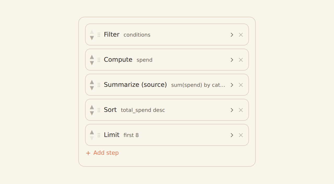
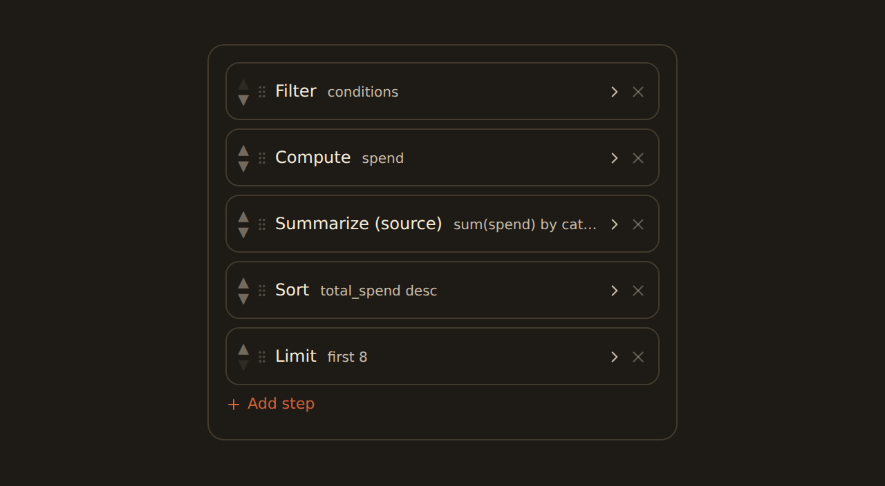
The channels cover the common case of one feed. When you need more, open Shape data from the Data tab. That dialog is a multi-step pipeline, kept out of the everyday channel controls so the simple path stays simple. Each step does one thing:
- Filter: drop rows before charting (for example, only this year).
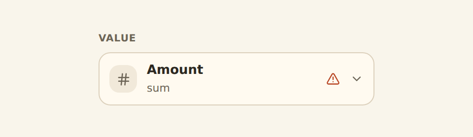
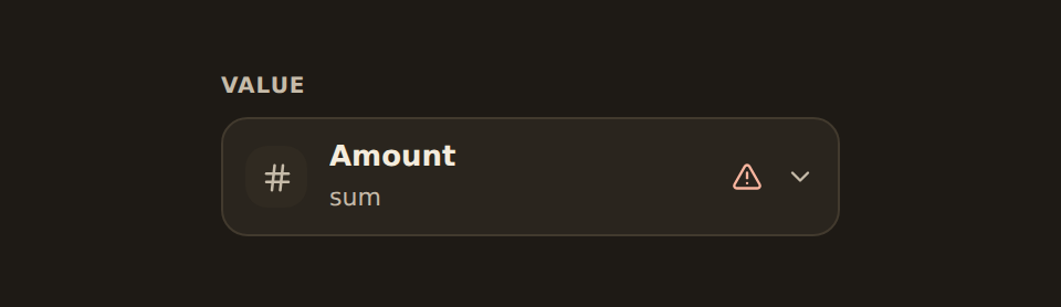
- Summarize: group and total rows at the data level (this is the step that, if you then also aggregate on the chart, triggers the double-count warning above).
- Sort and Limit: order the rows and keep the first few.
- Compute: derive a new column with an expression. This is the one place the everyday "no formulas" rule does not apply.
- Join: combine two feeds into one source.
Binding into a table#
A Table widget binds fields as columns rather than axes, but the idea is the same: you choose which fields appear and how each one reads. Beyond plain text and numbers, a column can render as currency, a status pill, a progress bar, a tiny sparkline, a heat-shaded cell, a duration, a rating, a chip list, a link, and more. So your Amount column can show as money, and a category column can show as colored pills. The per-column formatting lives in the table widget's own controls; see the KPI, table and gauge guide for how to set each column's display.
Related guides#
- The chart kind catalog: pick the kind that fits your binding.
- Filters & cross-filtering: let viewers narrow every widget at once.
- KPI, table & gauge widgets: binding specifics for the non-chart kinds.
Add dashboard filters
Use this page with your AI assistant
Every BankSync doc is available as plain Markdown for agents and LLMs.