The Chart Kind Catalog
Browse every chart kind BankSync can render, grouped by what they are good at, with a quick start for the everyday kinds and how switching kinds reuses your data binding.
8 min read
On this page
Every data-bound widget renders as one chart kind. BankSync supports a large catalog of kinds. You pick a kind when you add a widget and can switch it any time later. Switching reuses the fields you already bound, so trying line, then area, then column is usually a one-click experiment, not a rebuild.
Not sure which one to pick?
- Line for a value over time (balance, daily spend).
- Bar / Column to compare a value across categories (spend by merchant).
- Pie / Donut for a few categories' share of a total.
- KPI for a single headline number (this month's spend).
- Table for the underlying rows.
The rest of this page is a reference catalog. The everyday kinds above are listed first in each group, and the more specialized kinds (Stream, Beeswarm, Sankey, Chord, and so on) follow for when you need them.
Two places you pick a kind#
There are two pickers, and they group the kinds slightly differently. Both reach the same catalog.
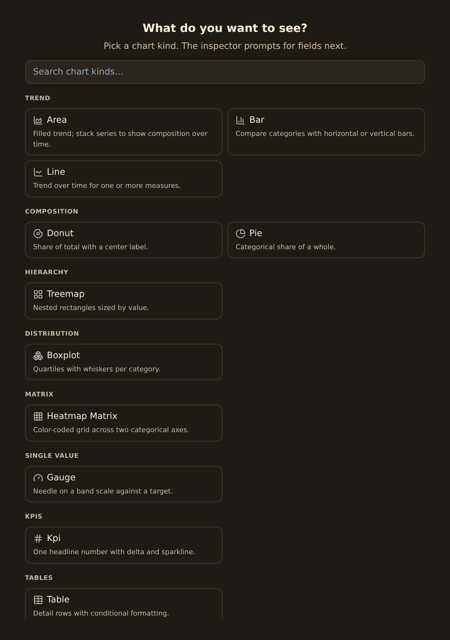
- The first-pick picker appears on an empty canvas under the heading What do you want to see? It groups kinds by visual family: Trend, Composition, Hierarchy, Distribution, Matrix, Single value, Relational, and Financial. You pick the look first, then the inspector prompts you for the fields.
- The Chart type picker lives in the inspector (the panel that opens when you select a widget). It groups kinds by the question they answer: Time series, Comparison, Part-of-whole, Distribution, Correlation, Flow / network, Matrix / heatmap, Radial, Financial, and Single value. Use it to switch an existing widget's kind without losing your bound fields.
The tables below follow the inspector's "question" grouping, since that is where you spend most of your time once a widget exists.

In the inspector, the Chart type dropdown lists the same kinds under question-based headings (Time series, Comparison, Part-of-whole, and so on), so you can switch an existing widget's kind from there without leaving its field bindings.
A worked example#
Say you want to see spend per category from your Transactions feed:
- Add a widget and point it at your Transactions feed.
- In the What do you want to see? picker, choose Bar (under Trend) or open the inspector's Chart type picker and choose Bar / Column (under Comparison).
- In the inspector, set Group by to Category and Value to the sum of Amount.
- To see the same numbers as a ranked list instead, switch the kind to Lollipop / Dot: your Category and Amount stay bound, so it is a one-click change.
That is the whole loop: pick a kind, bind a category and a number, switch kinds freely.
Time series#
Show how a value changes over time. These expect a date on one axis.
| Kind | Use it for |
|---|---|
| Line | A value over time (balance, spend per day). |
| Area | A line with the area filled, to emphasize volume. |
| Stacked area | Several series stacked to show the total and the mix. |
| Stream | A flowing, center-aligned stacked area for shifting mixes. |
| Step line | Values that hold then jump (like a balance after each transaction). |
| Sparkline | A tiny inline trend with no axes, great inside a KPI. |
Comparison#
Compare a value across categories.
| Kind | Use it for |
|---|---|
| Bar / Column | Compare a measure across categories (spend by merchant). |
| Grouped bar | Compare several measures side by side per category. |
| Stacked bar | Show each category's total and its parts. |
| 100% stacked bar | Compare the mix across categories, ignoring totals. |
| Lollipop / Dot | A lighter bar alternative for ranked values. |
| Bullet | A value against a target or threshold. |
Part of a whole#
Show how parts add up to a total. These need a category to slice by. Pie / Donut is the everyday one; the rest are stylistic variations.
| Kind | Use it for |
|---|---|
| Pie / Donut | A few categories' share of a total. |
| Nightingale / Radial bar | A circular take on category comparison (a "rose" chart, bars drawn around a center). |
| Treemap / Sunburst | Nested shares (category then subcategory). |
| Mosaic / Waffle | Proportions as tiled blocks. |
| Funnel / Pyramid | Stages that narrow from top to bottom. |
Distribution#
Show how values are spread out. Histogram is the everyday one; the rest are specialized statistical views.
| Kind | Use it for |
|---|---|
| Histogram | How often values fall in each range (transaction sizes). |
| Density / Ridgeline | A smoothed version of a histogram, one curve or several stacked. |
| Box plot / Violin | The spread and outliers per category (the middle, the range, the stragglers). |
| Strip / Beeswarm / Jitter | Every individual value as a dot, spread out so they don't overlap. |
Correlation#
Show how two measures relate. Scatter is the everyday one; the rest handle very dense data or many measures at once.
| Kind | Use it for |
|---|---|
| Scatter | Two measures plotted against each other. |
| Bubble | A scatter with a third measure shown as the dot size. |
| Hexbin / Contour | A scatter so dense that it is summarized by how crowded each area is. |
| Parallel coordinates | Compare many measures across items on side-by-side scales. |
Flow and network#
Show movement or relationships between things. These are specialized; reach for them when a bar or table can't show how amounts move between groups.
| Kind | Use it for |
|---|---|
| Sankey / Alluvial | Flows between stages, drawn as ribbons (income into categories). |
| Chord / Arc | Relationships between entities, drawn around or along an edge. |
| Network | A graph of connected nodes. |
Matrix and heatmap#
Show intensity across two dimensions as color. Heatmap and Calendar heatmap are the approachable ones.
| Kind | Use it for |
|---|---|
| Heatmap / Heatmap matrix | A value across two categories, shown as color intensity in a grid. |
| Correlation matrix | How every measure correlates with every other (a specialized grid). |
| Calendar heatmap / Punchcard | Activity by day, or by day and hour, like a contribution calendar. |
Radial, financial, and single value#
| Kind | Use it for |
|---|---|
| Radar / Polar / Circular bar | Compare measures around a circle. |
| Candlestick / OHLC / Volume profile | Price movement for investment data. |
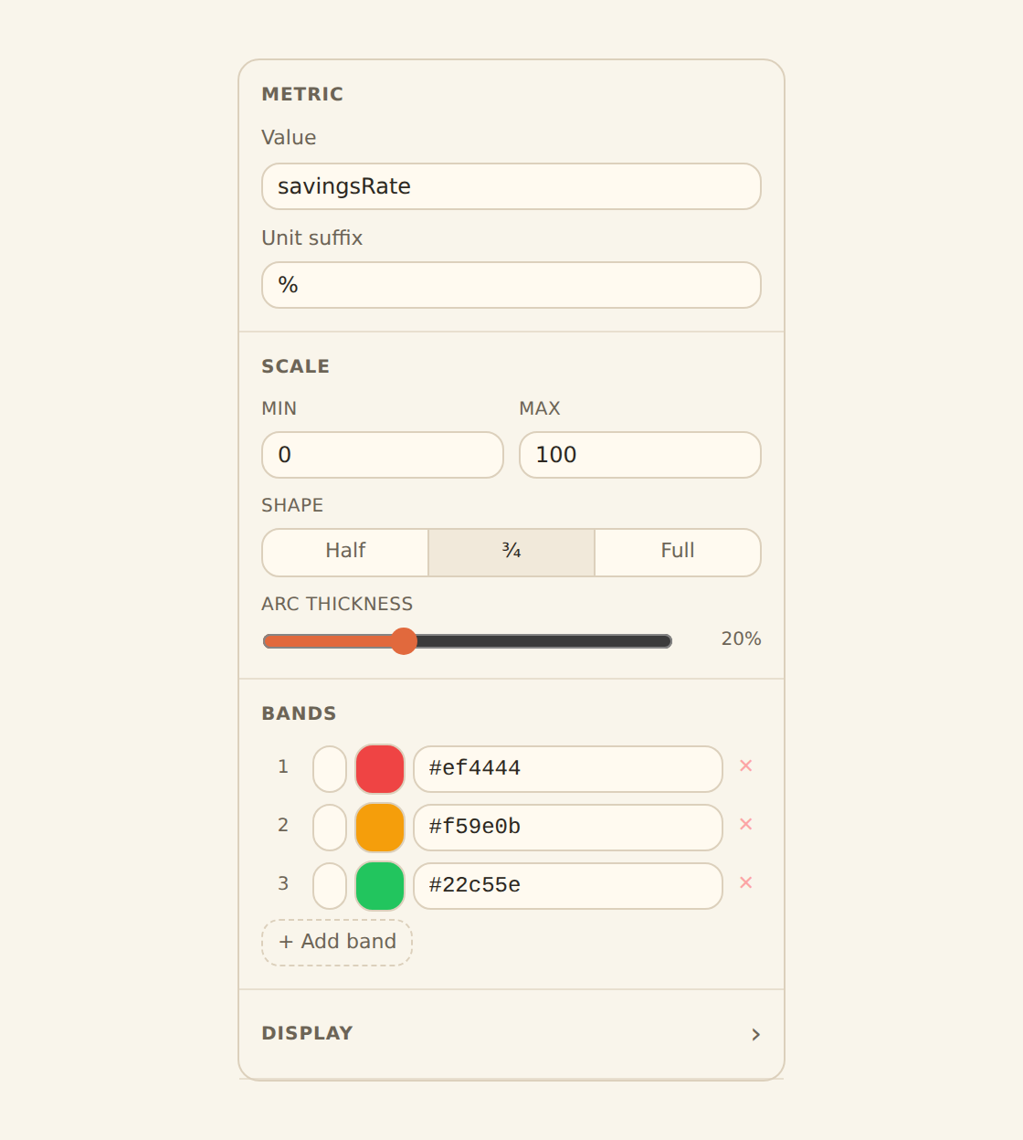
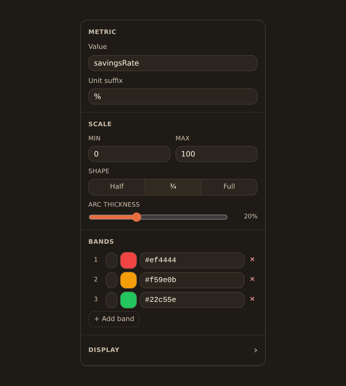
| Gauge / Meter / Progress | A single value against a scale or target. |
The single-value kinds (Gauge, Meter, Progress) show one number against a scale or target rather than a series of points. A gauge is the most legible of the three for a goal like a savings rate.
Switching kinds without losing work#
When you change a widget's kind in the inspector's Chart type picker, BankSync re-uses the fields you already bound (and their settings, like the grouping grain or the sum) and fills in only what the new kind adds. So line, area, and column swap freely.
One thing to know: if you switch to a kind that holds fewer fields, the extras are dropped rather than kept. For example, a multi-series line carries a date, a number, and a series split. Switch it to a pie (which has room only for a category and a value) and the series split has nowhere to go, so it falls away. Switch back and you re-bind it. Within kinds of the same shape (line, area, column, bar) nothing is lost.
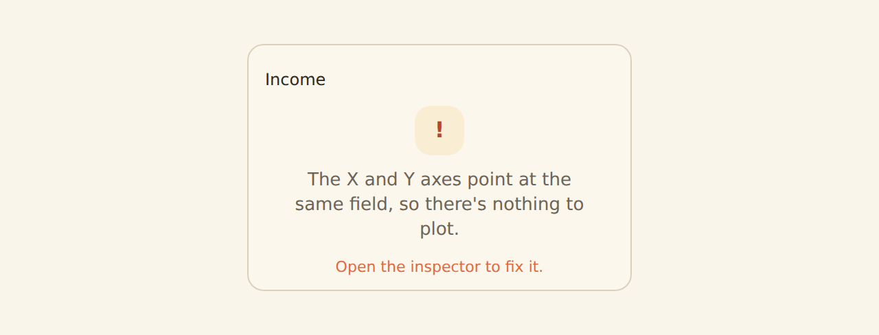
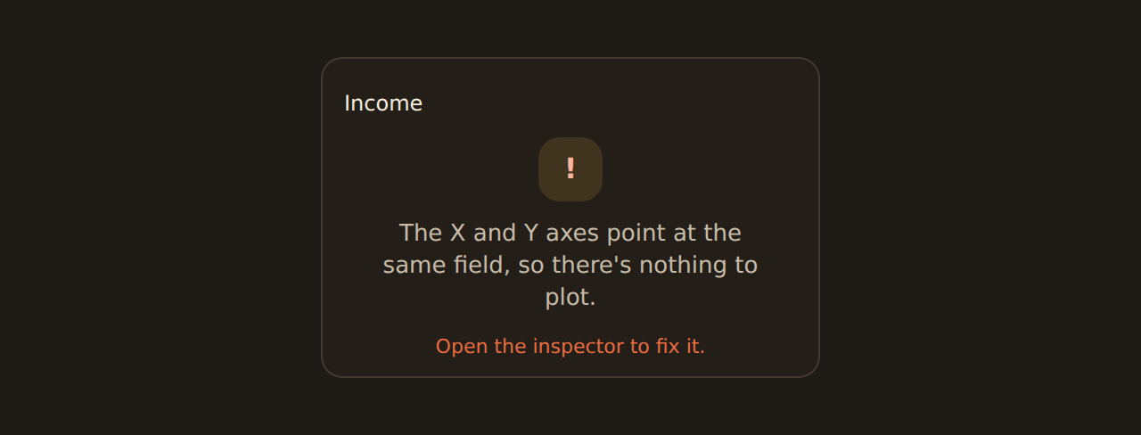
If a kind cannot render your current data, the picker disables it and tells you why in plain language, for example "needs a category field" or "needs a number field" rather than naming internal field roles. Bind the missing kind of field and the option lights up.
Financial kinds want price columns
Less common kinds are editable too
Preview kinds
The catalog tracks the renderer
Beyond charts#
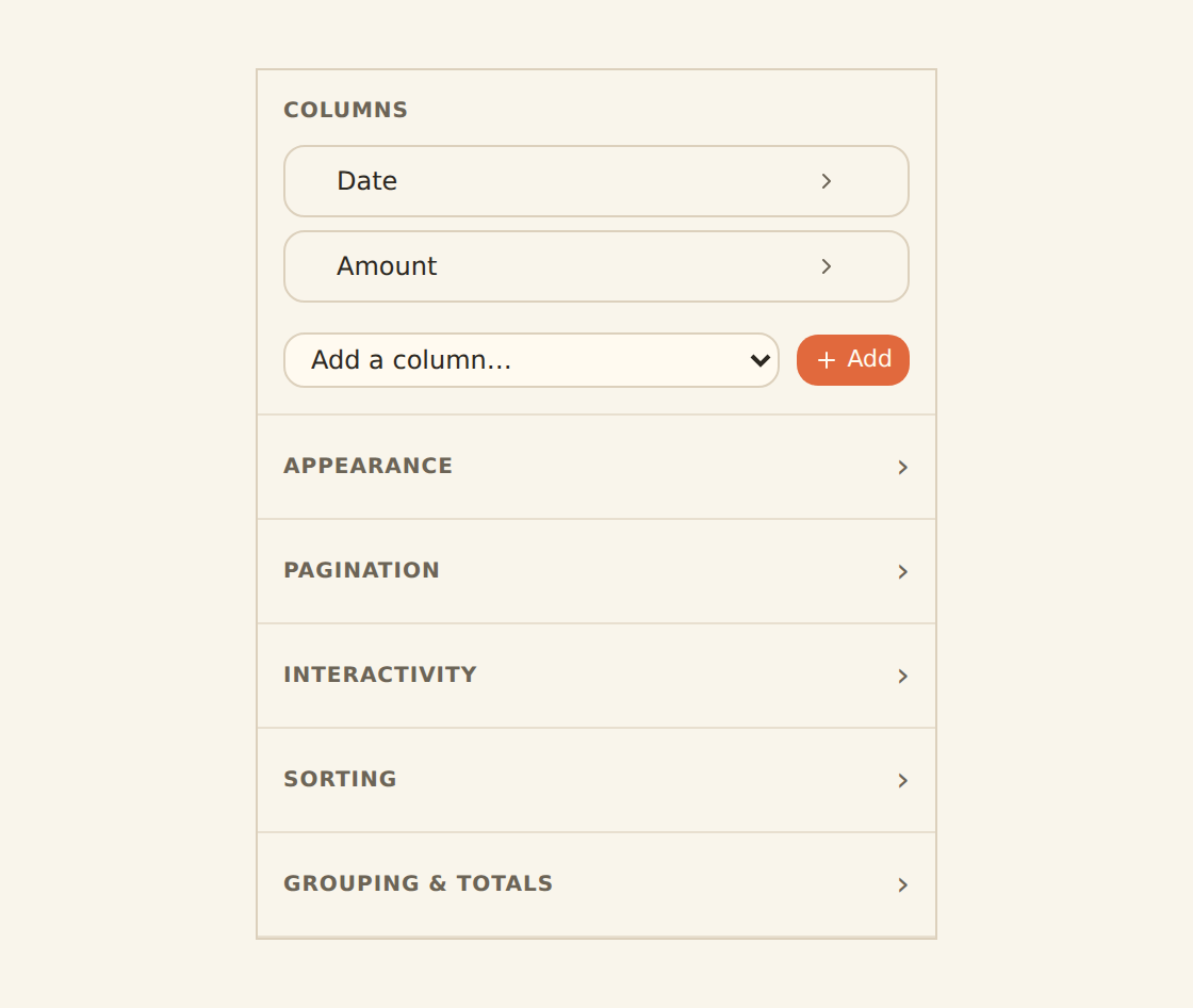
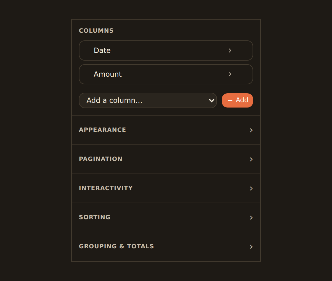
KPI, Table, and the single-value kinds are covered in depth on their own page. Tables in particular do more than show plain rows: each column can be formatted as currency, a status pill, a progress bar, an inline sparkline, a rating, and more, all configured in the table's column manager.
Related guides#
- Binding data: choose the fields a chart kind needs.
- Adding widgets: start a widget of any kind.
- KPI, table & gauge widgets: the non-chart kinds in depth.
Bind your data
Use this page with your AI assistant
Every BankSync doc is available as plain Markdown for agents and LLMs.