Channels & Encoding: how the inspector binds each chart family
Why the inspector's binding chips change when you switch chart kinds, what required, axis, bucket, aggregate, and top-N mean, and which families re-total your numbers.
7 min read
On this page
A channel is one visual slot a chart fills with a field from your data: the bottom axis, the left axis, the slices of a pie, the source and target of a flow. The inspector's Data tab shows one chip per channel, and you tap a chip to pick its field and shape it.
The Binding data guide walks the everyday line-and-bar path (Group by, Value, Split into series). This page explains the part that surprises people: the set of chips is not fixed. It changes with the chart kind, because different chart families plot data in fundamentally different ways. A pie has slices, not axes. A flow chart has a source and a target. A gauge has a single number. So when you switch a widget from a bar to a pie to a sankey, the chips in the Data tab swap to match.
Why the chips change#
Every chart kind belongs to a family, and the family decides which channels you see. The inspector reads the active kind, looks up its family, and renders exactly that family's channel chips. Nothing about your widget is broken when the chips look different from a neighbor's: the controls are simply describing what that kind needs.
Here is the same idea stated as the rule the app follows: pick a kind, get that kind's family, get that family's channels. Switch kinds and the channels re-derive. This is why a heatmap asks for an X, a Y, and a Value while a donut asks only for a Category and a Value.
The families and their channels#
The table below is the full map. The chip labels are the words you actually see in the Data tab.
| Family | Example kinds | Channels you bind |
|---|---|---|
| Cartesian | line, area, bar, column, stacked bar, lollipop, stream | Group by (X), Value (Y), Split into series, Color |
| Scatter | scatter, bubble, hexbin, contour | X (a number), Y (a number), Size (optional), Color |
| Distribution | box plot, violin, ridgeline, beeswarm, strip | Category (optional), Value, Split into series |
| Histogram | histogram, density | Value (a single number to bin) |
| Part of a whole | pie, donut, funnel, pyramid, waffle | Category, Value |
| Flow / relational | sankey, chord, network, alluvial, arc | Source, Target, Value |
| Matrix | heatmap, heatmap matrix, punchcard | X, Y, Value |
| Calendar | calendar heatmap | Date, Value |
| Radar | radar | Axis, Value, Split into series |
| Single value | gauge, meter, progress | Value |
| Financial | candlestick, OHLC, volume profile | Date (Open/High/Low/Close come from the columns, see below) |
| Multi-dimension | parallel coordinates, correlation matrix | Group (the chart reads your numeric columns) |
| Hierarchy | treemap, sunburst | Category, Value |
A few of these read more than the chips show. The financial kinds (candlestick, OHLC) plot from columns literally named open, high, low, close, so the only thing you bind is the Date; you shape the four price columns in the Shape data step. The multi-dimension kinds read all of your numeric columns at once rather than asking you to bind each. The hierarchy kinds take a Category and a Value and build the nested shape for you.
What the chip controls mean#
Each chip can offer a small set of controls. Which ones appear depends on the channel and on the field you bind to it.
Required
Some channels must be filled for the chart to draw. A pie needs both a Category and a Value; a flow needs a Source, a Target, and a Value. The chip for a required channel shows an outline prompt until you bind it.
Axis
Channels that map to a real chart axis (the X and Y of a bar, for instance) carry axis-label and tick-format controls. A pie slice or a sankey link is not on an axis, so those chips skip the axis controls.
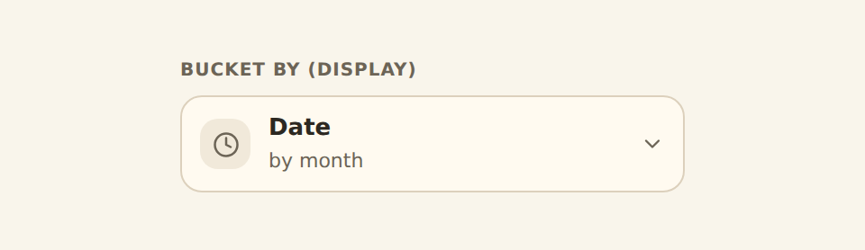
Bucket by
Appears only on a Group-by channel that accepts dates AND when the field you bound is a date. It groups timestamps into Day, Week, Month, Quarter, Year, or a repeating cycle (day of week, month of year).
Aggregate
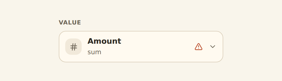
Appears on a Value (measure) channel. It chooses how to combine rows that fall into the same group: Sum, Average, Count, and so on. See "Which families re-total" below for when it actually does work.
Keep top N
Appears on a category channel (not on dates or values). It limits a high-cardinality field to its largest few groups and folds the rest into "Other", so a 387-slice pie becomes a clean top 8 plus Other.
Allows one or many
Most channels take one field. A few (like the Value of a multi-line cartesian chart) take a list, so the chip lets you add several fields and shows one picker per bound field.
The field picker inside each chip is filtered to the fields that make sense for that channel. A Value channel offers numbers, never an ID column or a foreign key. A Group-by channel offers categories and dates. This is why the same feed shows different field lists on different chips: the chip only proposes fields it can actually plot.
Which families re-total your numbers#
This is the most useful nuance on the page, because it explains a control that sometimes does nothing.
When a chart plots one mark per row, your raw feed rows usually need to be rolled up to be meaningful (all of January's transactions become one bar). For those families, the Aggregate control on the Value chip is what does the rolling up, and changing it from Sum to Average to Count changes the chart. These are the families that re-total at render time:
- Cartesian (line, bar, area, and friends)
- Part of a whole (pie, donut, funnel)
- Radar
- Matrix (heatmap, punchcard)
- Calendar (calendar heatmap)
- Flow (sankey, chord), which sums repeated source-to-target links into one
Other families do not re-total, because they handle the math themselves or plot raw points:
- Histogram and density bin the numbers and count them for you.
- Box plot, violin, and the other distribution kinds compute their own quartiles and shapes.
- Scatter and bubble plot one point per row, untouched.
- Single value (gauge, meter, progress) and financial kinds read the value as given.
Why does Sum do nothing on my histogram?
Counting twice
A worked example: the same data, three families#
Say you have a Transactions feed and you want to understand category spend.
As a bar (cartesian)
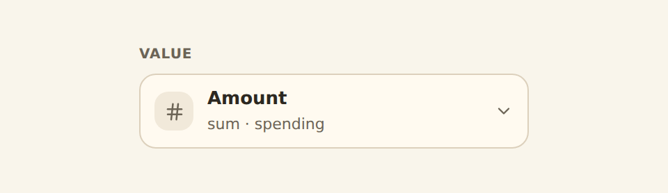
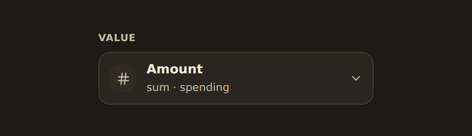
Pick a Column chart. You get a Group by chip and a Value chip. Bind Group by to Category, bind Value to Amount, leave the Aggregate on Sum, and set Show amount as to Spending. The renderer totals each category into one bar.
As a donut (part of a whole)
Switch the kind to Donut. The chips become Category and Value (no axes, because slices are not on an axis). Your Category and Amount carry over into them, and the renderer still totals per category, now drawn as slices. Add Keep top 8 so a long category list stays readable.
As a flow (relational)
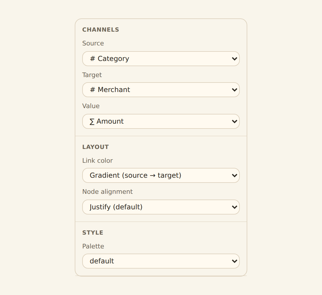
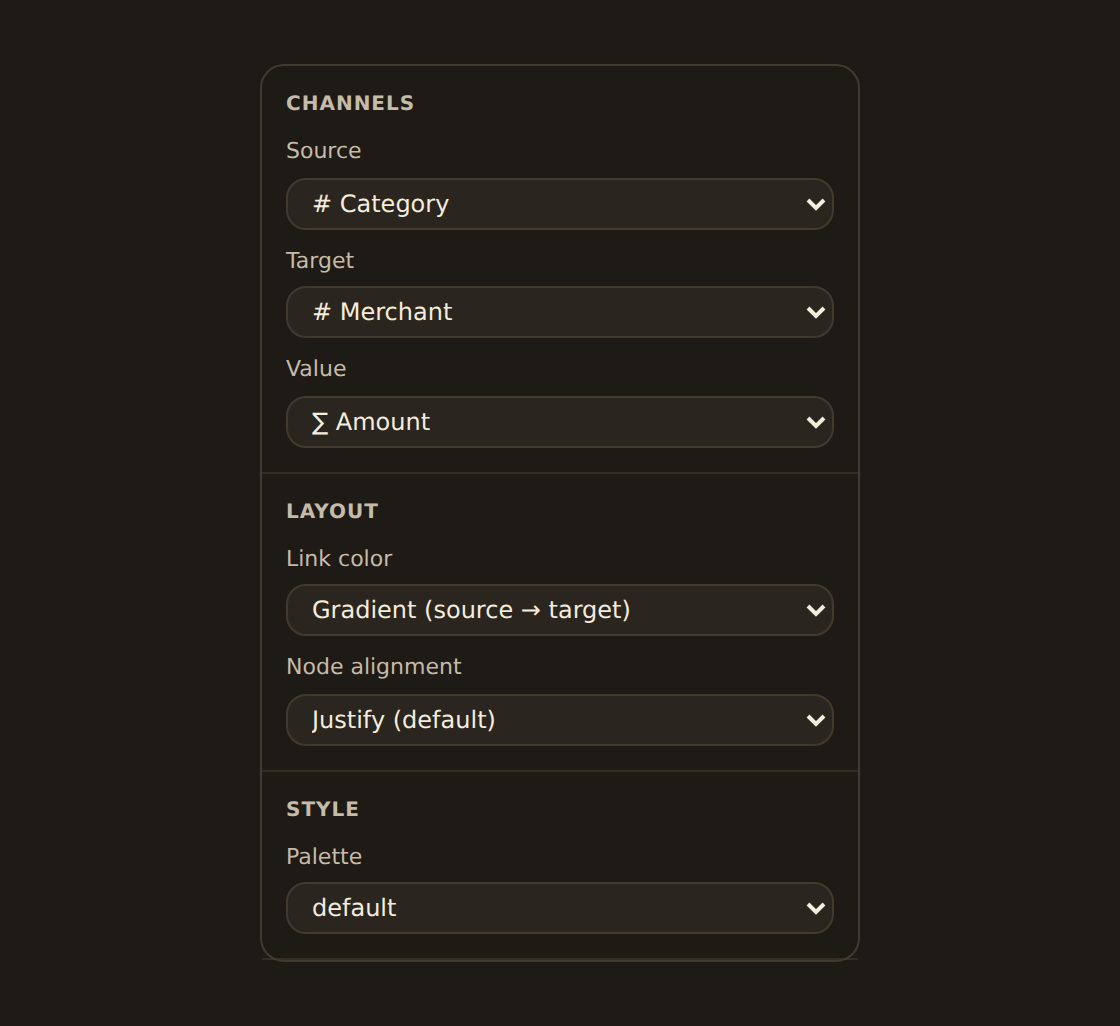
Switch to Sankey. Now the chips are Source, Target, and Value. A single category field cannot fill both a Source and a Target, so you bind, say, Account to Source and Category to Target and Amount to Value, and the chart shows money flowing from accounts into categories. Repeated account-to-category pairs are summed into one link.
The point: your underlying data never changed. Switching families only changed which channels the inspector asked you to fill, and how the renderer treated the numbers.
Switching kinds keeps what it can
Custom widgets today#
Package-based custom widgets declare stable named input ports and
read each one with useDataset(inputId). Their inspector matches those logical inputs to compatible
live banks or synced feeds; these data inputs are separate from a chart's visual channels.
Legacy custom widgets still read one default dataset with useData(). They do not gain named ports
until they are deliberately migrated to a package manifest and installed as a v2 widget. See
Custom-widget data and permissions for the
binding and consent flow.
Related guides#
- Binding data: the everyday Group by, Value, and Split into series controls in depth.
- The chart kind catalog: pick the kind (and therefore the family) that fits your question.
- KPI, table and gauge widgets: binding for the single-value and column-based kinds.
- Filters & cross-filtering: let viewers narrow every widget at once.
Browse the chart kinds
Use this page with your AI assistant
Every BankSync doc is available as plain Markdown for agents and LLMs.