Chart Kind Gallery
A per-kind reference for all ~56 chart kinds: what each one shows, the data fields it needs, and one line on when to reach for it.
14 min read
On this page
- How to read this page
- A worked example: reading one row
- Cartesian: lines, bars, and areas on an x/y plane
- Scatter: relationships between two numbers
- Distribution: how values are spread out
- Histogram: how often values fall in each range
- Part of a whole: slices of a total
- Hierarchical: nested shares
- Flow: how amounts move between things
- Matrix: intensity across two dimensions
- Calendar: a value per day
- Radar: measures around a circle
- Multi-dimension: many measures at once
- Financial: price movement
- Single value: one number on a scale
- What about column, KPI, and table?
- Does this kind add up my rows?
- Switching kinds keeps your fields
- Related guides
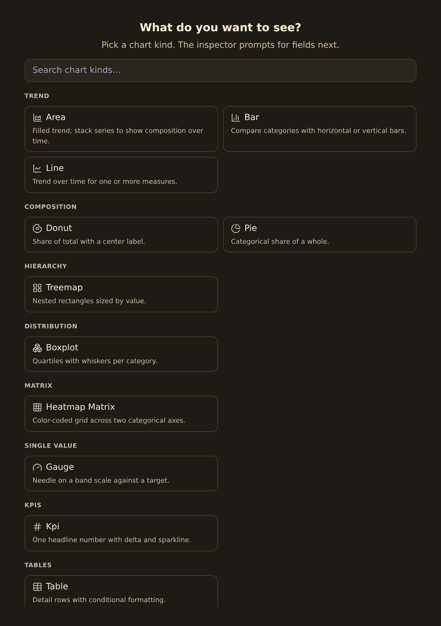
This is the encyclopedia entry for every chart kind BankSync can draw. The Chart Kind Catalog groups kinds by the question they answer and helps you choose one. This page goes one level deeper: for each kind it tells you what it shows, which fields it needs (its channels), and what it is good for. Use it when a kind is not behaving the way you expect, or when you want to know exactly what data a kind wants before you bind it.
A channel is a slot a chart binds a field into. A bar chart, for example, has an X-axis channel (the category) and a Y-axis channel (the number). Different kinds have different channels, which is why the controls in the inspector change when you switch kinds. The rest of this page is organized by family: kinds in the same family share the same channels and behave the same way, so once you learn one kind in a family you know them all.
Two numbers to keep straight

How to read this page#
Each family has a short table. The columns are:
- Kind: the name you see in the picker.
- What it shows: the picture it draws.
- Needs: the fields you must bind (the required channels). Optional channels are noted in the family intro, not the table.
- Good for: the one situation it is built for.
Why the inspector controls change between kinds
A worked example: reading one row#
Say you bind a sankey (in the Flow family). Its row reads:
- Needs: Source (a category), Target (a category), Value (a number).
- What it shows: ribbons flowing from each source to each target, with ribbon thickness set by the value.
- Good for: showing how money moves between accounts or from income into spending categories.
So to build "money flow between accounts" you bind your from-account field to Source, your to-account field to Target, and the amount to Value. The chart sums the amount for every repeated from/to pair, so duplicate transfers between the same two accounts merge into one thick ribbon. That summing behavior is covered in Does this kind add up my rows? at the end.
Cartesian: lines, bars, and areas on an x/y plane#
The largest family. Every kind here plots a category or date on the X axis and a number on the Y axis, with two optional extra slots: Series (split one line or bar into several, one per value) and Color. These are the everyday workhorses.
| Kind | What it shows | Needs | Good for |
|---|---|---|---|
| Line | A connected line through the points | X (date/category) + Y (number) | A value over time, like balance or daily spend |
| Area | A line with the area below it filled | X + Y | Emphasizing volume under a trend |
| Stacked area | Several filled series stacked into a total | X + Y (+ Series) | A total and its changing mix over time |
| Stream | A flowing, center-aligned stacked area | X + Y (+ Series) | Shifting mixes where the total matters less than the shape |
| Step line | A line that holds flat then jumps | X + Y | Values that change in steps, like a balance after each transaction |
| Sparkline | A tiny line with no axes | X + Y | A trend tucked inside a KPI or a tight cell |
| Bar | Horizontal bars per category | X (category) + Y | Comparing a value across categories |
| Column | Vertical bars per category | X + Y | The same comparison, drawn upright |
| Grouped bar | Bars sitting side by side per category | X + Y (+ Color) | Comparing several measures within each category |
| Stacked bar | Bars stacked into a per-category total | X + Y (+ Color) | A category's total and its parts |
| 100% stacked bar | Stacked bars normalized to full height | X + Y (+ Color) | Comparing the mix across categories, ignoring totals |
| Lollipop | A dot on a thin stalk per category | X + Y | A lighter bar for ranked values |
| Dot | A single dot per category, no stalk | X + Y | A minimal ranked comparison |
| Bullet | A bar against a target marker | X + Y | A value against a goal or threshold |
| Mosaic | Tiled blocks sized by value | X + Y | Proportions shown as a block layout |
| Nightingale | Bars drawn around a center (a rose chart) | X + Y | A circular take on category comparison |
| Radial bar | Bars curved around a ring | X + Y | A compact circular ranking |
| Polar | Bars or points on polar coordinates | X + Y | A round comparison where angle carries meaning |
| Circular bar | Bars arranged on a circular baseline | X + Y | A decorative circular ranking |
Scatter: relationships between two numbers#
Both axes here are numbers, not categories. Two optional slots add a third and fourth dimension: Size (a bubble) and Color.
| Kind | What it shows | Needs | Good for |
|---|---|---|---|
| Scatter | One dot per row, placed by two numbers | X (number) + Y (number) | Whether two measures move together |
| Bubble | A scatter where dot size is a third number | X + Y (+ Size) | Three measures at once |
| Hexbin | A scatter summarized into hexagonal bins by density | X + Y | Very dense point clouds where individual dots overlap |
| Contour | A scatter summarized into density bands | X + Y | The shape of where points cluster |
Distribution: how values are spread out#
These take a Value (a number) and optionally a Category to split by. They summarize the spread internally, so you do not bind a separate total.
| Kind | What it shows | Needs | Good for |
|---|---|---|---|
| Box plot | A box for the middle, whiskers for the range, dots for outliers | Value (+ optional Category) | The spread and outliers per category |
| Violin | A smooth curve showing where values cluster | Value (+ optional Category) | The shape of a distribution per category |
| Ridgeline | Several distribution curves stacked | Value (+ optional Category) | Comparing the shape of many groups |
| Strip | Every value as a dot on a line | Value (+ optional Category) | Seeing each individual value |
| Beeswarm | Dots packed apart so none overlap | Value (+ optional Category) | Every value, spread for readability |
| Jitter | Dots nudged off a single line | Value (+ optional Category) | Individual values that would otherwise stack |
Histogram: how often values fall in each range#
Bin a single number and count how many rows land in each bin. There is one channel: the value to bin.
| Kind | What it shows | Needs | Good for |
|---|---|---|---|
| Histogram | Bars counting rows in each value range | Value (number) | How often values fall in each band, like transaction sizes |
| Density | A smoothed histogram curve | Value (number) | The same shape without hard bin edges |
Part of a whole: slices of a total#
These need a Category to slice by and a Value for each slice's size. Pie and Donut are the everyday choices; the rest are stylistic.
| Kind | What it shows | Needs | Good for |
|---|---|---|---|
| Pie | A circle split into slices | Category + Value | A few categories' share of a total |
| Donut | A pie with a hollow center | Category + Value | The same, with room for a centered total |
| Funnel | Stages that narrow top to bottom | Category + Value | A drop-off through ordered stages |
| Pyramid | A funnel drawn as a triangle | Category + Value | Stage sizes shown as a pyramid |
| Waffle | A grid of squares filled by share | Category + Value | Proportions as countable tiles |
Hierarchical: nested shares#
These read a Category and a Value and nest the categories into levels. The renderer reshapes your fields into a name/value/children structure for you.
| Kind | What it shows | Needs | Good for |
|---|---|---|---|
| Treemap | Nested rectangles sized by value | Category + Value | Category-then-subcategory shares in a compact block |
| Sunburst | Nested rings sized by value | Category + Value | The same nesting drawn as a radial ring chart |
Nesting deeper than one level
Flow: how amounts move between things#
These bind two categories, Source and Target, plus a Value for the magnitude. None of them use an axis.
| Kind | What it shows | Needs | Good for |
|---|---|---|---|
| Sankey | Ribbons flowing source to target, thickness by value | Source + Target + Value | Money flowing between accounts or income into categories |
| Chord | Pairwise flows arranged around a circle | Source + Target + Value | Two-way relationships between a set of entities |
| Alluvial | Multi-stage flow across ordered dimensions | Source + Target + Value | How rows split and merge across several stages |
| Network | A force-directed graph of connected nodes | Source + Target (Value optional) | A web of connections between entities |
| Arc | Nodes on one line joined by arcs | Source + Target | Connections along a single axis |
Matrix: intensity across two dimensions#
These bind an X category, a Y category, and a Value shown as color or dot size in a grid.
| Kind | What it shows | Needs | Good for |
|---|---|---|---|
| Heatmap | A grid of cells colored by value | X + Y + Value | A value across two categories, as color intensity |
| Heatmap matrix | The same grid for a full matrix of categories | X + Y + Value | Comparing every row against every column |
| Punchcard | A grid of dots sized by value | X + Y + Value | Activity by day and hour, like a busy-times chart |
Calendar: a value per day#
One channel for the Date and one for the Value, laid out as a calendar.
| Kind | What it shows | Needs | Good for |
|---|---|---|---|
| Calendar heatmap | One colored cell per day | Date + Value | Daily activity over a year, like a contribution calendar |
Radar: measures around a circle#
Binds an Axis category (one spoke per value), a Value, and an optional Series (one polygon per series).
| Kind | What it shows | Needs | Good for |
|---|---|---|---|
| Radar | A polygon over several spokes | Axis + Value (+ optional Series) | Comparing several measures for one or a few items |
Multi-dimension: many measures at once#
These read several numeric columns at once rather than one bound value. They expose only an optional Group color slot; the measures are read from the data's numeric columns (or from a column list you shape in the query).
| Kind | What it shows | Needs | Good for |
|---|---|---|---|
| Parallel coordinates | Lines crossing several vertical scales | Numeric columns (+ optional Group) | Comparing many measures across items |
| Correlation matrix | A grid of how each measure relates to every other | Numeric columns | Spotting which measures move together |
Financial: price movement#
These plot price over time. They bind a Date axis, and they read the price columns by fixed name: Open, High, Low, Close (named o/h/l/c). You shape those columns in the query rather than binding them as channels.
| Kind | What it shows | Needs | Good for |
|---|---|---|---|
| Candlestick | One candle per period (open/high/low/close) | Date axis + Open/High/Low/Close columns | Price movement for an investment over time |
| OHLC | The same data as tick bars | Date axis + Open/High/Low/Close columns | A lighter price chart |
| Volume profile | Volume traded at each price level | Price level + Volume columns | Where trading concentrated by price |
Financial kinds need price columns
Single value: one number on a scale#
These show a single number, so they have just one Value channel and no axes. They are the simplest kinds to bind.
| Kind | What it shows | Needs | Good for |
|---|---|---|---|
| Gauge | A needle on a banded arc | Value (number) | A number against a target or healthy range |
| Meter | A linear bar against a target | Value (number) | The same as a gauge, drawn as a bar |
| Progress | A fill showing value as a percent of max | Value (number) | Progress toward a goal as a percentage |
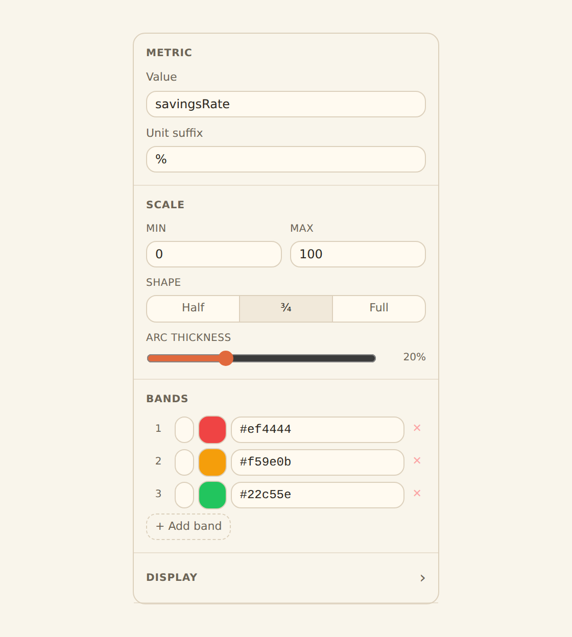
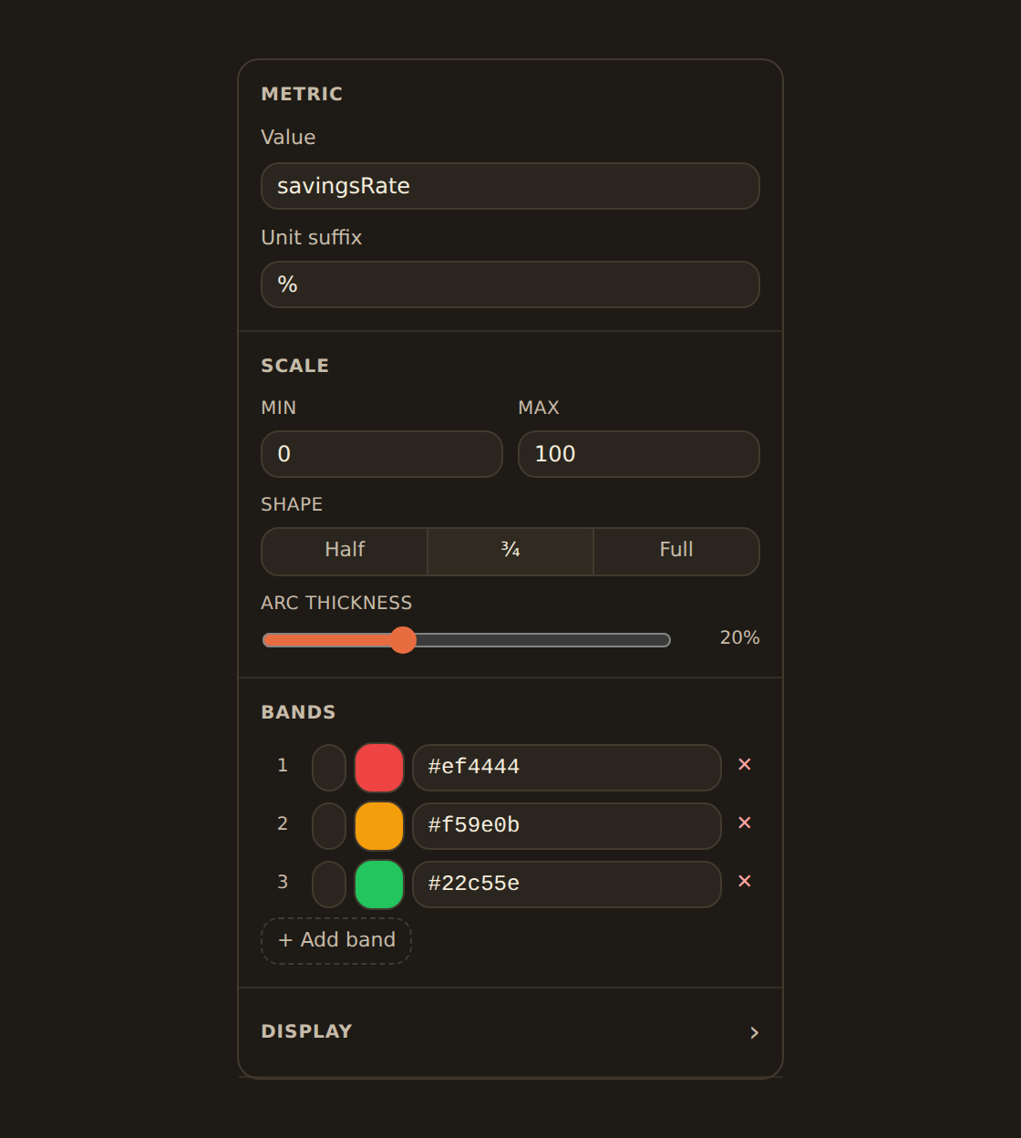
The single-number widgets (Gauge, Meter, Progress) overlap with the KPI widget, which also shows one figure but adds comparisons, sparklines, and number formatting. For a headline number with context, see KPI, table & gauge widgets.
What about column, KPI, and table?#
A few kinds you will use a lot are not in the families above:
- Column (vertical bars) is the bar family drawn upright; bind it exactly like a bar.
- KPI and Table are not chart kinds at all, they are their own widget types. KPI shows one headline number with comparison and a sparkline; Table shows formatted rows. Both have their own page: KPI, table & gauge widgets.
Does this kind add up my rows?#
Some kinds total your rows before plotting; others plot every row as-is. This is why a Sum setting changes a bar chart but does nothing on a histogram.
| These kinds total rows per group | These plot rows as-is or summarize internally |
|---|---|
| Cartesian (line, bar, area, and the rest) | Scatter (one dot per row) |
| Part of a whole (pie, donut, funnel) | Distribution (box plot, violin, beeswarm) |
| Radar | Histogram and Density (they count and bin) |
| Matrix (heatmap, punchcard) | Hierarchical (treemap, sunburst) |
| Calendar heatmap | Multi-dimension (parallel coords) |
| Flow (sankey, chord), which sums repeated source/target pairs | Single value, Financial |
For the kinds that total rows, the Binding data page covers the aggregate control (Sum, Average, Count, and so on) and the double-count warning that appears if your data was already totaled in the Shape data step. For the kinds that plot rows as-is, an aggregate setting has no effect, so you will not see one.
The less-common families (Flow, Hierarchical, Matrix) render exactly like the everyday ones once bound: a sankey or treemap sits in a normal widget cell on the canvas, draws from your live feed data, and resizes with the grid like any other chart.
Switching kinds keeps your fields#
Because kinds in the same family share channels, switching between them is a one-click change that keeps your bound fields. Line to area to column keeps the date and the number. Switching across families can drop fields the new kind has no slot for: a multi-series line moved to a pie (which has only a category and a value) loses its series split. Switch back and you re-bind it. See The Chart Kind Catalog for more on switching.
Some kinds still carry a Preview badge
Related guides#
- The Chart Kind Catalog: choose a kind by the question it answers.
- Binding data: set the fields each kind needs and how to total them.
- KPI, table & gauge widgets: the non-chart widget types.
- Adding widgets: get a widget of any kind onto the canvas.
Bind your data
Use this page with your AI assistant
Every BankSync doc is available as plain Markdown for agents and LLMs.