Adding Widgets
Add charts, KPIs, and tables to a dashboard: browse the full widget catalog, reuse a widget you already built, or ask an AI agent.
6 min read
On this page
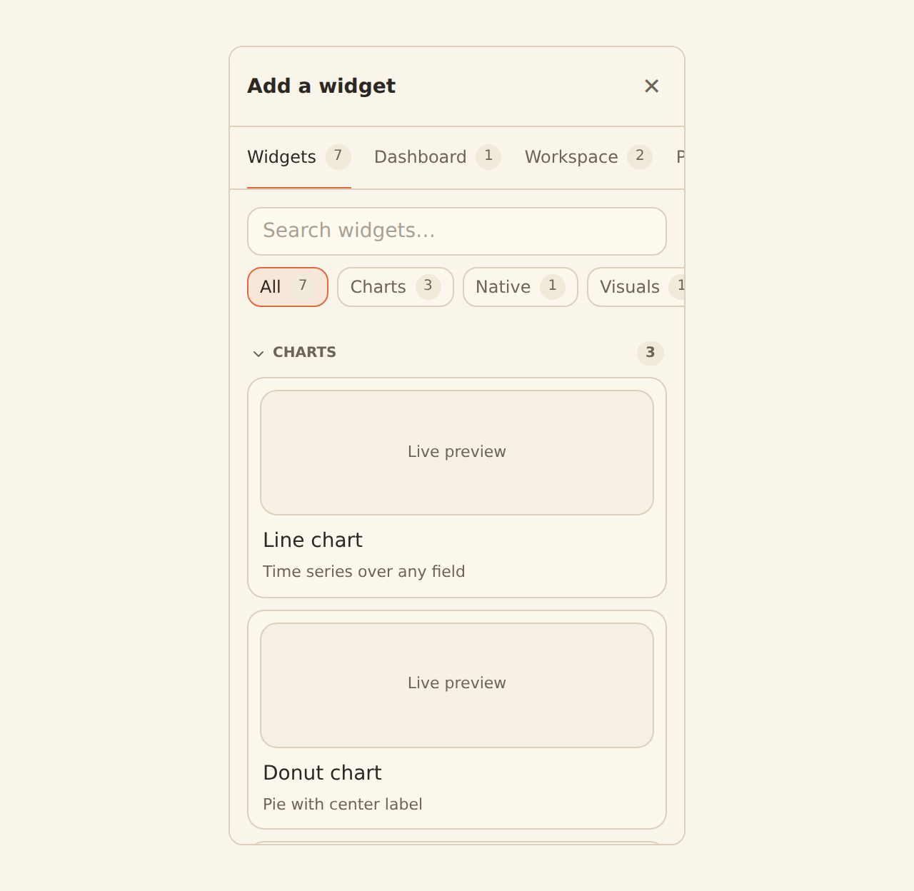
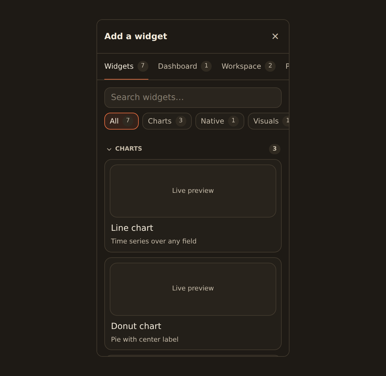
Widgets are the building blocks of a dashboard: each one is a chart, a KPI, a table, or another visual tied to your data. You add widgets from the library, which you open with the ] key or the Widgets button in the editor toolbar. The library has three tabs, each a different way to get to the widget you want.
The three ways to add a widget#
All
The full catalog of widget kinds — every chart type plus KPI, table, text, image, embed, filter, and action. Search it, preview each card live, and click or drag to add a fresh widget.
Dashboard
The widgets already on this dashboard, in one place. Edit one (opens the inspector) or remove it from the dashboard.
Workspace
Every widget you have already built. Reuse one across dashboards without rebuilding it.
A quick gloss of the terms that come up below: a widget is pinned to a dashboard (it appears there, but the underlying widget is shared, not copied); the inspector is the settings panel that opens when you select a widget; and to detach a widget is to remove it from one dashboard without deleting it.
Another way: ask an AI agent (staging)
Browsing the catalog#
The All tab is where most widgets start. It lists every widget kind — charts (line, area, bar, column, donut, and the rest), KPIs, tables, text notes, images, embeds, filter controls, and action buttons — with a search box at the top and a live mini-preview on each data-bound card. Type to narrow the list (for example "donut" or "table"), then add the one you want.
Add a widget from the catalog
Open the library
Press the bracket key, or click Widgets in the toolbar.Find a kind
Stay on the All tab and scroll, or type a word like "kpi" or "bar" to filter.
Preview it
Each data-bound card shows a live mini-preview rendered against sample rows.
Add it
Click the card to drop it at the next open spot, or drag it onto the canvas to place it precisely.
Worked example: spending by category
Whatever kind you start from, you can switch it in the inspector after placing it. This includes the less common kinds (treemap, radar, boxplot, sankey, sunburst, calendar heatmap, and similar): each one gives you a working field editor for picking the columns it needs, so you are not limited to the everyday charts.
What happens after you add a data widget#
BankSync prepares the widget against the sources you can actually access before it creates a runnable query and widget:
- With one compatible source and one valid field mapping, it completes setup and shows Using the source name · Change. The editor's Undo action can remove the new widget.
- With several compatible sources, it places the widget unconnected rather than picking for you. Its cell reads No data source connected yet with a Choose data action; the Data tab suggests the closest matches and lets you browse every bank, feed, and table in the workspace.
- With ambiguous fields, it asks which real fields should fill the widget's roles. It does not guess transaction-shaped names for a custom table.
- With no sources at all, the cell offers Connect bank, Create table, and Create feed, and reopens the same widget after a connection detour.
- If source inventory is temporarily unavailable, it says so and offers Retry. It does not misreport an outage as an empty workspace.
An unconnected widget owns no fake query, placeholder feed, or sample financial rows. It is a full widget — move, rename, duplicate, or delete it like any other — and safe to leave on an active dashboard while you design. It must be connected or removed before the dashboard can be published.
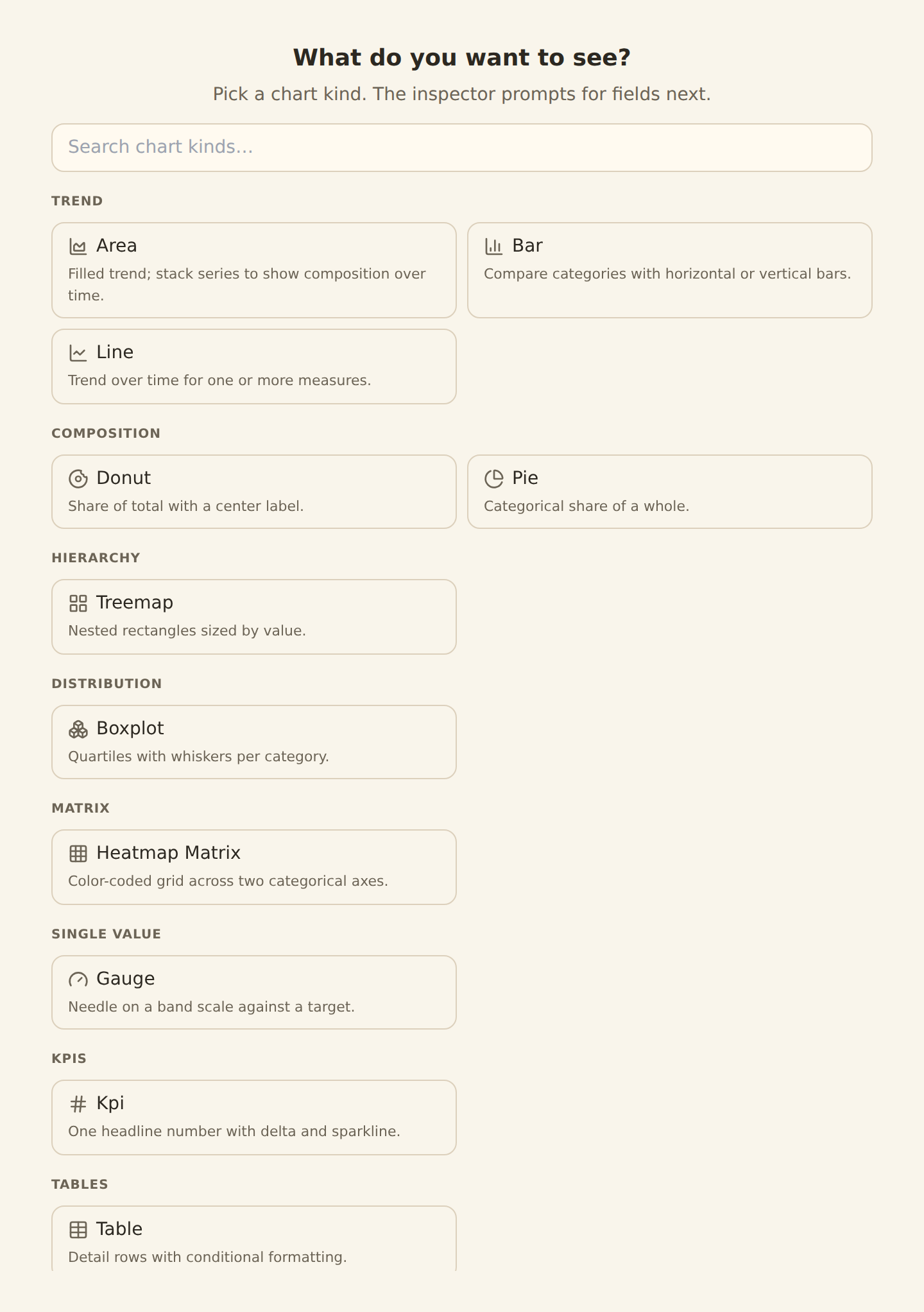
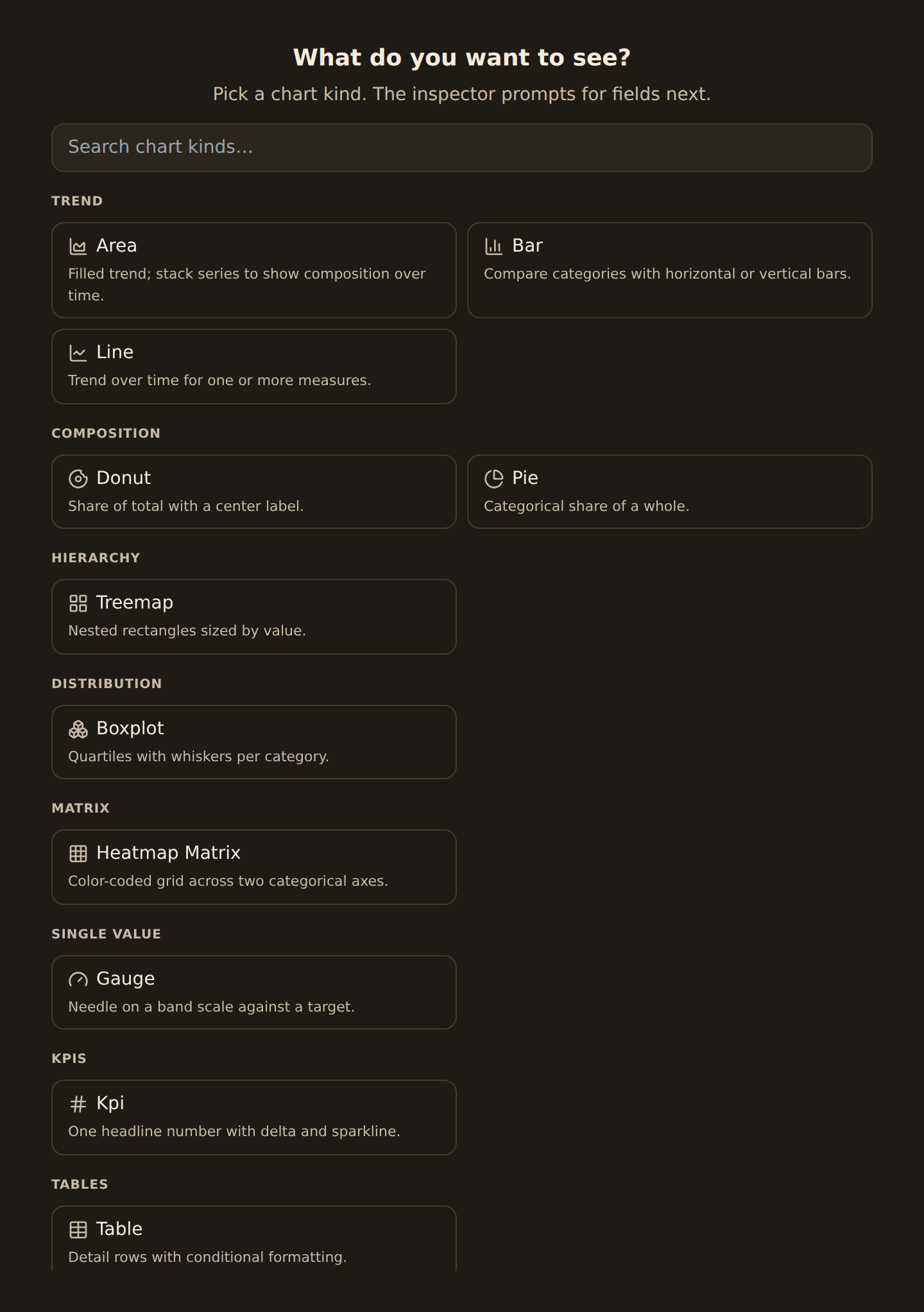
Gauge, meter, and progress are chart kinds (the "single value" family), so you find them in the catalog alongside line, bar, and the rest.
Placing a widget: click or drag#
This works the same way no matter which tab you added from. Clicking a library entry adds the widget at the next open spot on the grid. To place it precisely, drag it from the library onto the canvas: a ghost outline shows where it will land before you drop it. Once placed, drag the widget to move it and drag an edge to resize. The layout saves automatically.
On a brand-new, empty dashboard you do not even need to open the library first: the canvas shows an Add a widget prompt that opens the same chooser.
Reusing a widget you already built#
The Workspace tab lists every widget in your workspace. Adding one from here pins it onto the current dashboard rather than making a copy: it is the same widget, shown in more than one place. Edit it once and the change shows everywhere it is pinned. Each entry shows how many dashboards use it (for example "Used on 3 dashboards") and marks the ones already pinned to the current dashboard, so you can see at a glance whether changing it will ripple to other dashboards.
Pinning is not copying
More than charts#
Not every widget is a chart. The All tab lists every kind, charts and non-charts alike — search or scroll to find these:
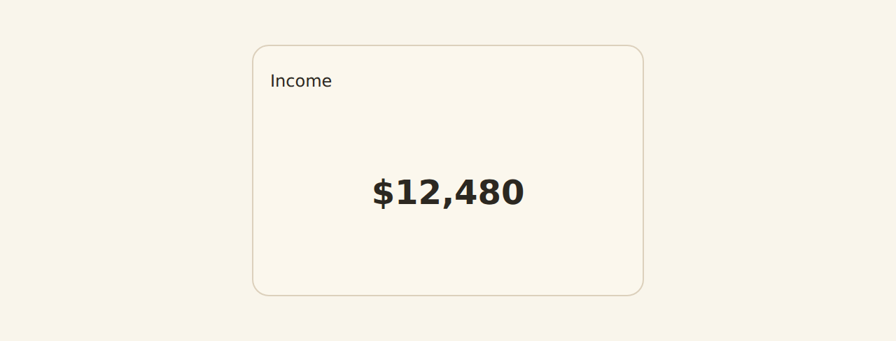
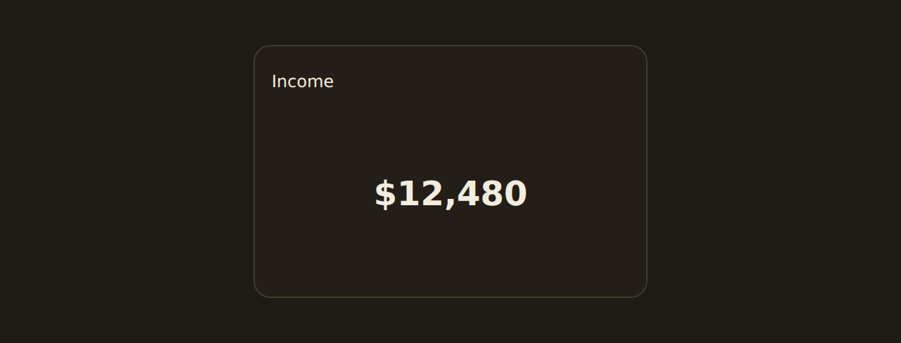
KPI
A single big number with an optional comparison and sparkline.
Table
A formatted, paginated table of rows. Each column can be styled per its meaning: currency, percent, status pills, progress bars, mini sparklines, ratings, chips, links, and more.
Text
A Markdown note for headings, context, or instructions.
Image & Embed
A static image or an embedded external page.
Filter & Action
A filter control, or a button that runs a workspace action.
Custom widget
For developers: author your own widget in TypeScript against the BankSync widget SDK.
Tables are richly formatted
Removing a widget from a dashboard#
There are two ways to take a widget off a dashboard, and both ask you to confirm:
- From the Dashboard tab of the library, find the widget and click its trash icon.
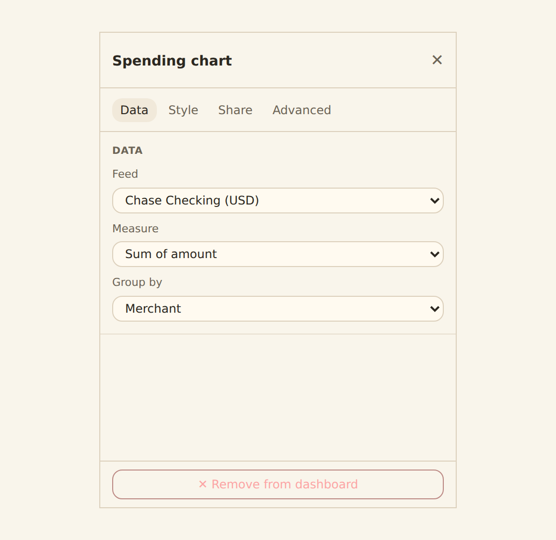
- Or select the widget on the canvas (its settings open in the inspector) and click ✕ Remove from dashboard at the bottom of the inspector.
Either way this detaches it from this dashboard only: the widget stays in your library, so any other dashboard that pins it is unaffected and you can re-add it later.
Related guides#
- Binding data: point a widget at a feed and choose what to group by and measure.
- The chart kind catalog: every chart kind and when to use it.
- KPI, table & gauge widgets: configure the non-chart widget types, including a table's per-column formats.
- Templates: the portable way to reuse a widget or a whole dashboard layout across workspaces.
- Publishing and sharing: share a widget or dashboard with people outside the editor.
Bind a widget to your data
Use this page with your AI assistant
Every BankSync doc is available as plain Markdown for agents and LLMs.